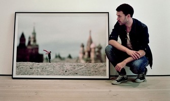
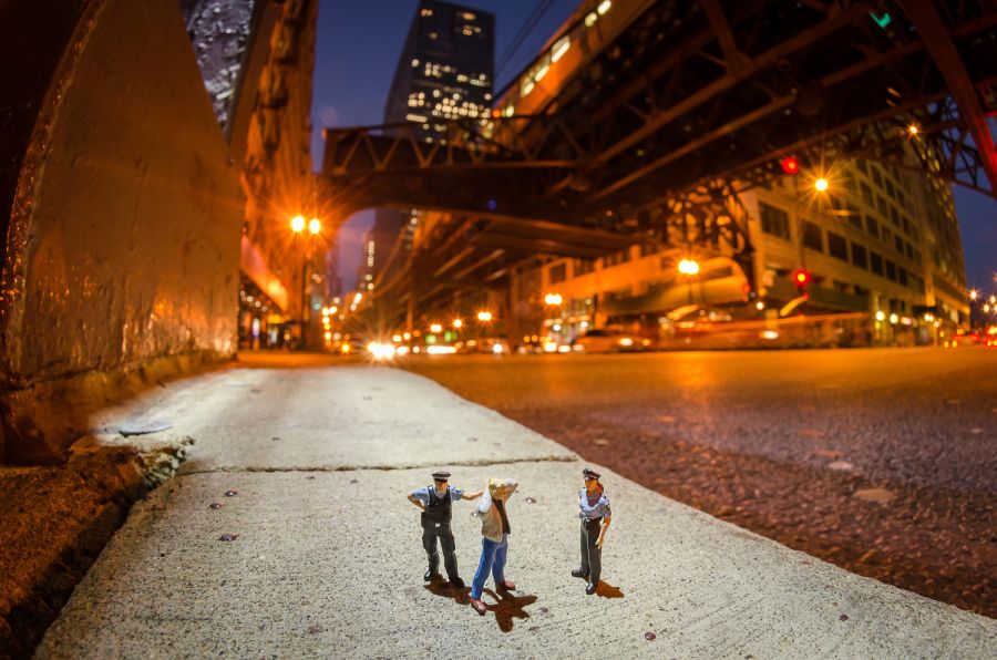
Slinkachu (British, b.1979) is a London-based artist who creates small-scale Street Art installations and photographs them. The Little People Project started in 2006, involves the remodelling and painting of miniature model train set characters, which are then placed, photographed, and left on the street.
Speaking about his work, Slinkachu says, "The street-based side of my work plays with the notion of surprise and I aim to encourage
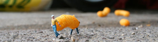
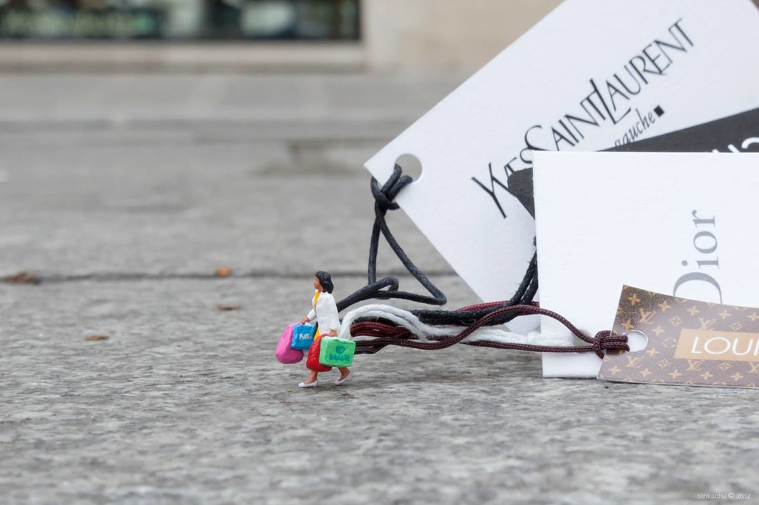
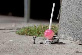
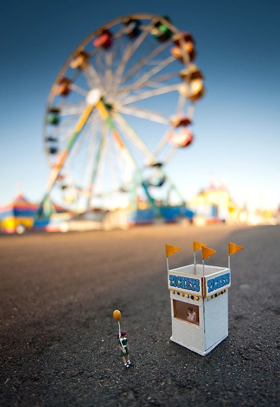
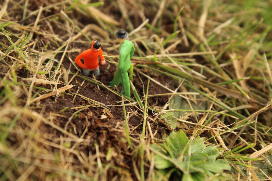
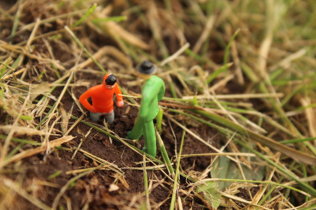
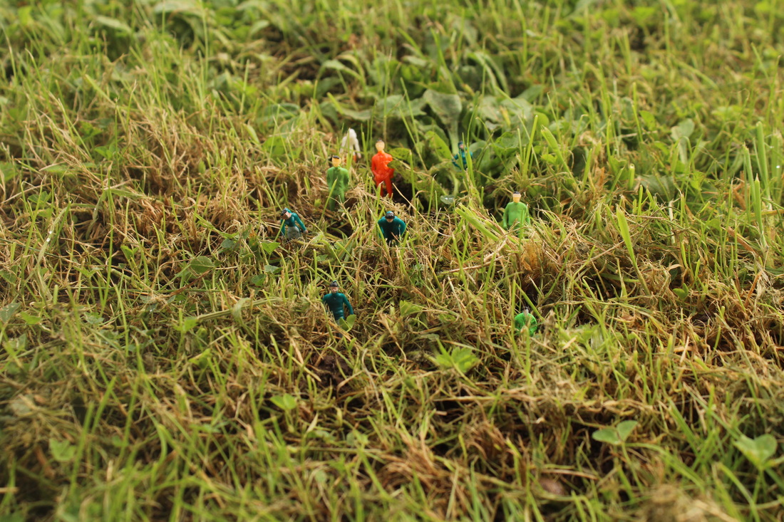
he uses a Canon 5D mk2. When he first started he just used a simple point-and-click digital camera and then later a Canon 400D. Slinkachu uses different settings of aperture to set the main focus on the train models. I would say the main 3 settings Slinkachu uses would be f/2.8, f/4 and f/5.6 as it sets the main image in focus and blurs out a bit of the background. Slinkachu creates different images using train models and different objects. For instance, the top right image shows a train model with a car which has a lollypop which has been placed on top to make it look like a kind of crash.
Speaking about his work, Slinkachu says, "The street-based side of my work plays with the notion of surprise and I aim to encourage
he uses a Canon 5D mk2. When he first started he just used a simple point-and-click digital camera and then later a Canon 400D. Slinkachu uses different settings of aperture to set the main focus on the train models. I would say the main 3 settings Slinkachu uses would be f/2.8, f/4 and f/5.6 as it sets the main image in focus and blurs out a bit of the background. Slinkachu creates different images using train models and different objects. For instance, the top right image shows a train model with a car which has a lollypop which has been placed on top to make it look like a kind of crash.
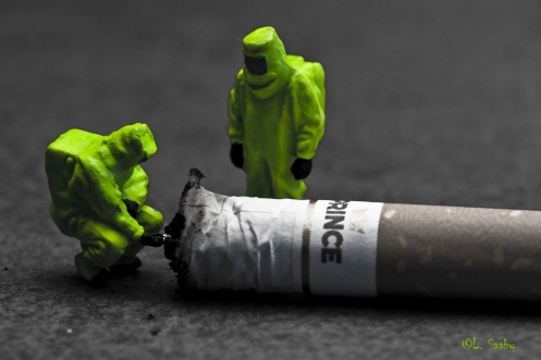
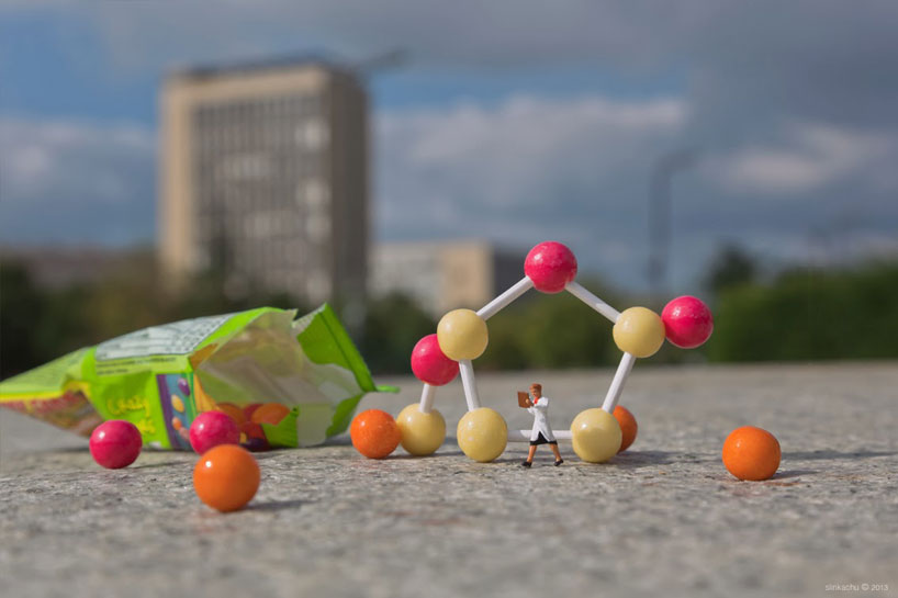
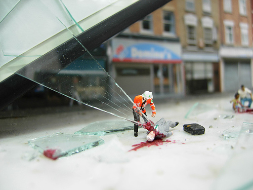
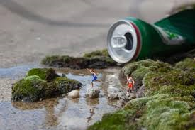
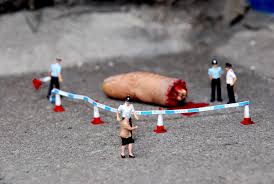
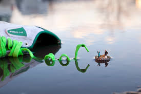
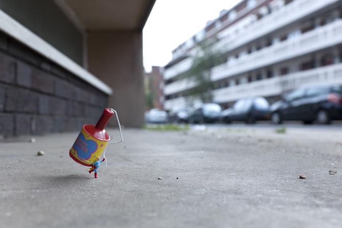
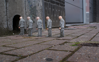
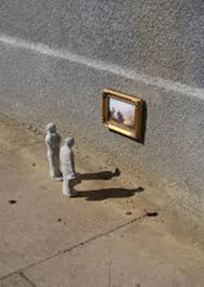
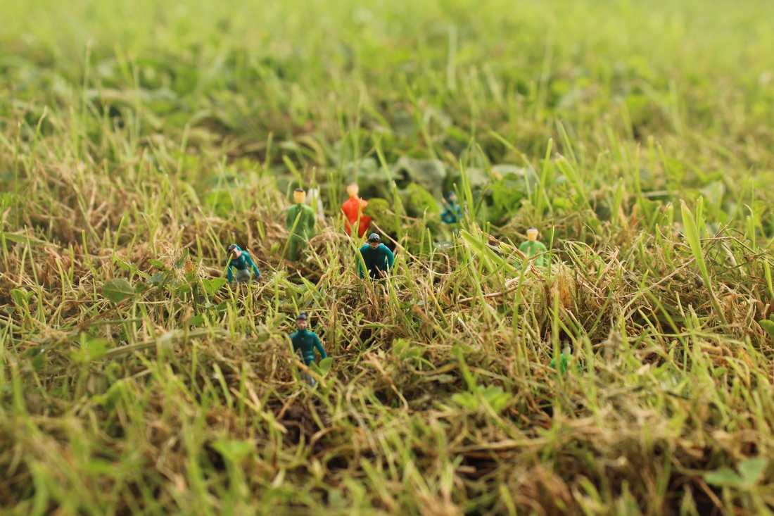
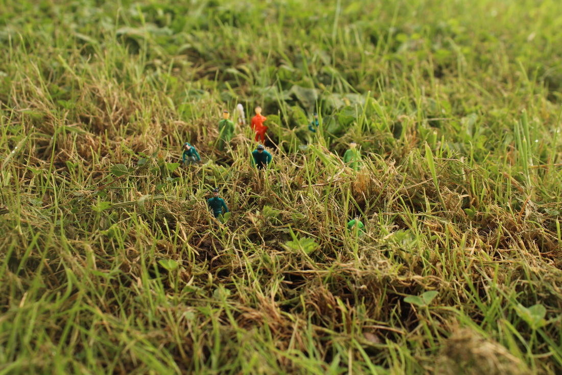
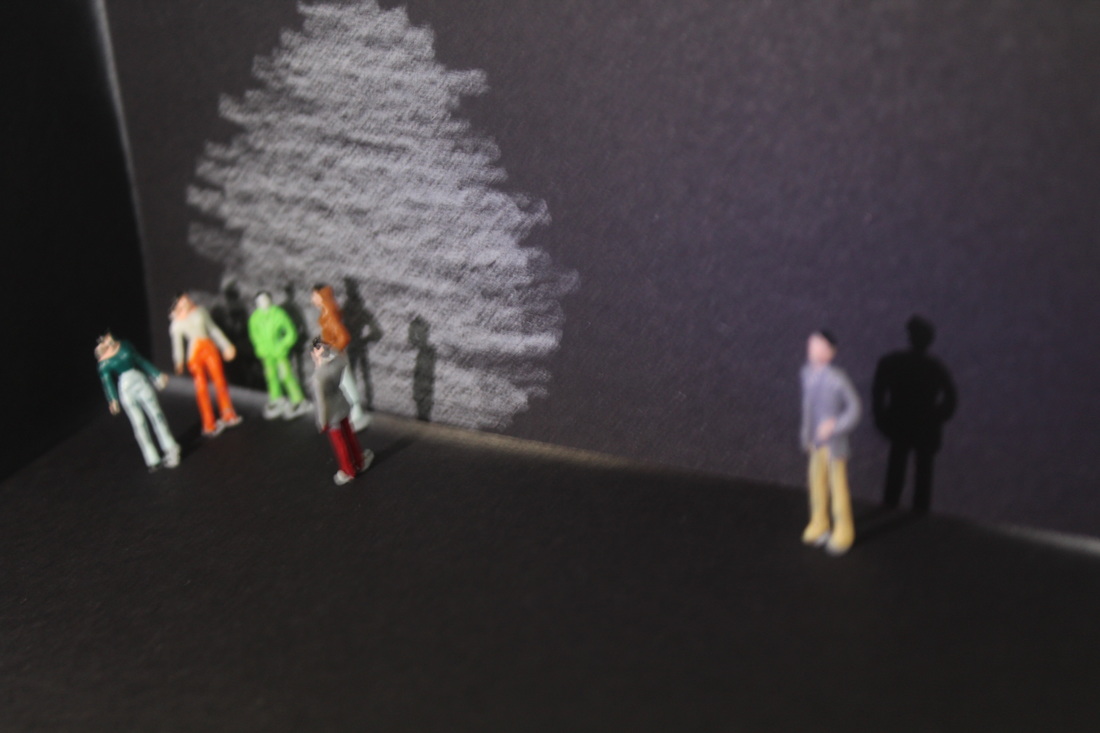
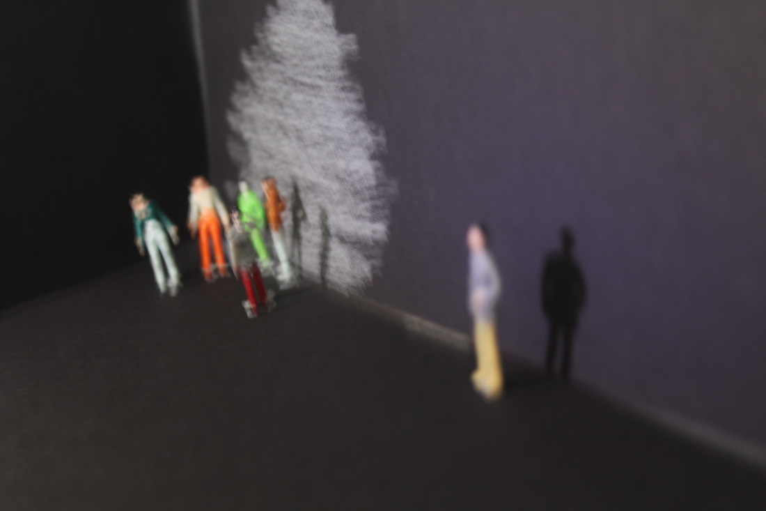
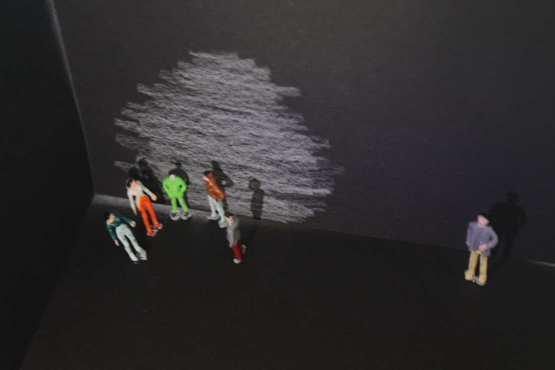
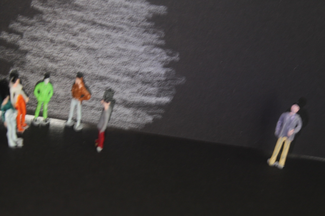
here are a few photographs that slinkachu took
I am not very fond of...
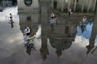
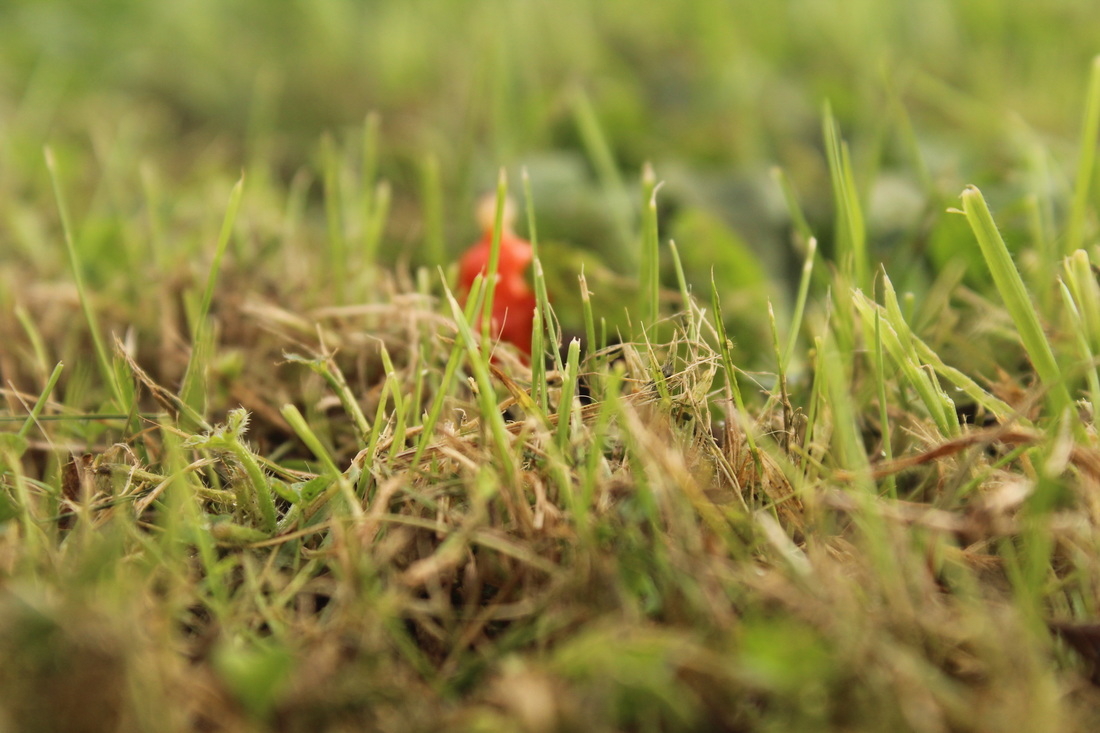
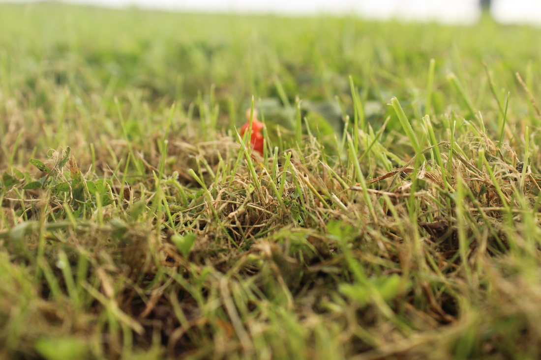
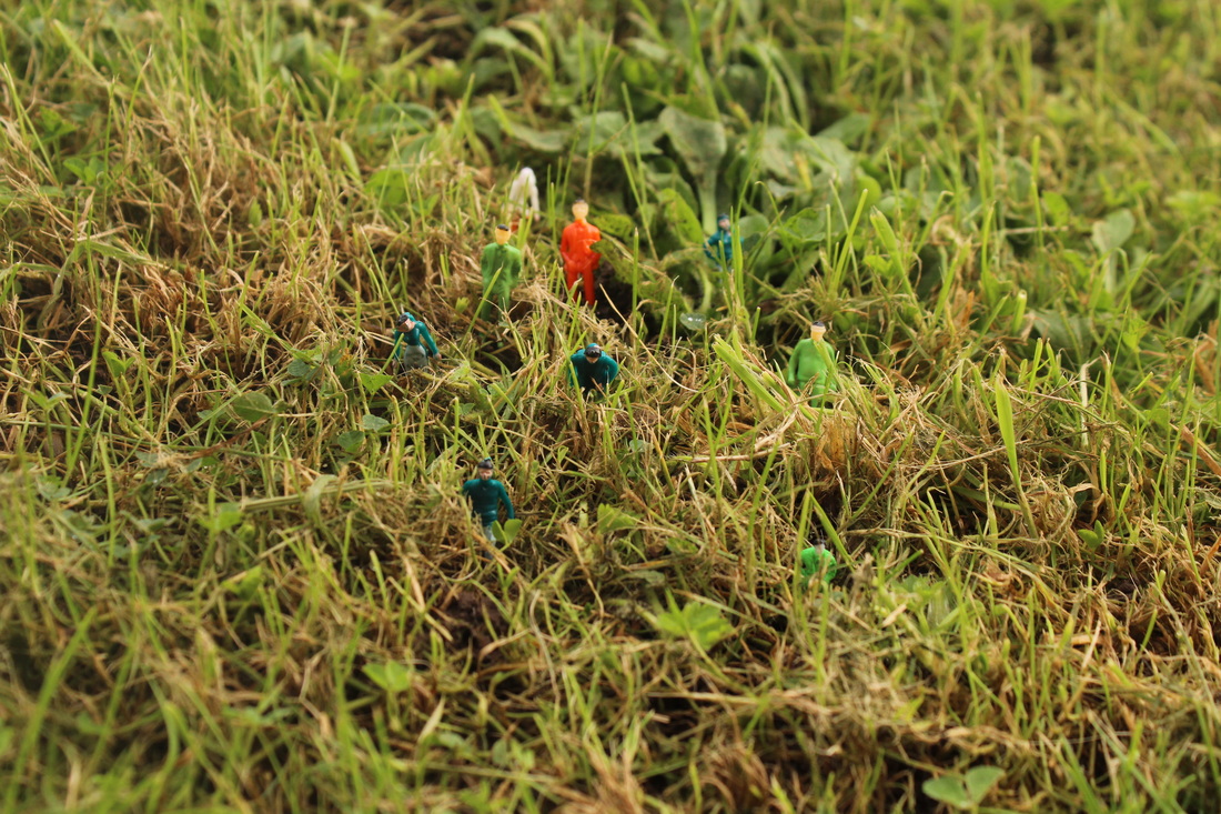
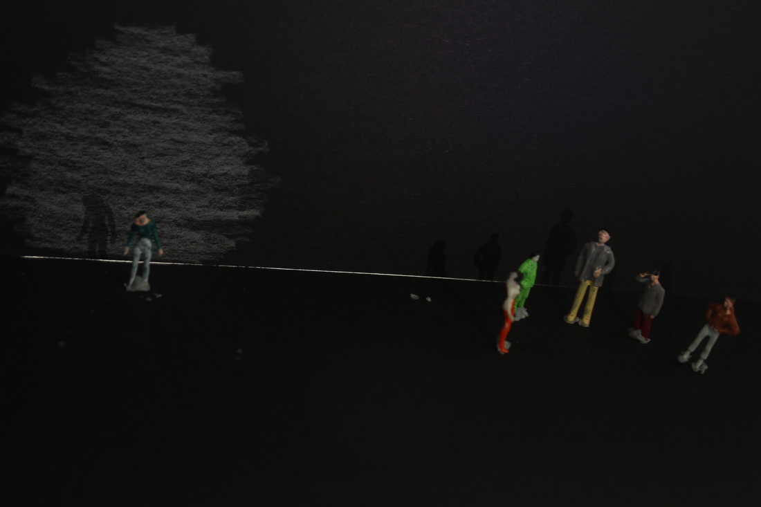
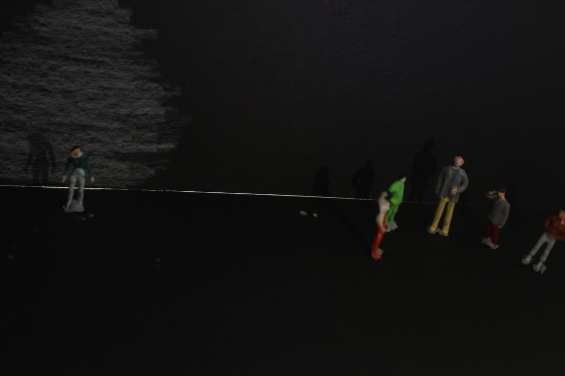
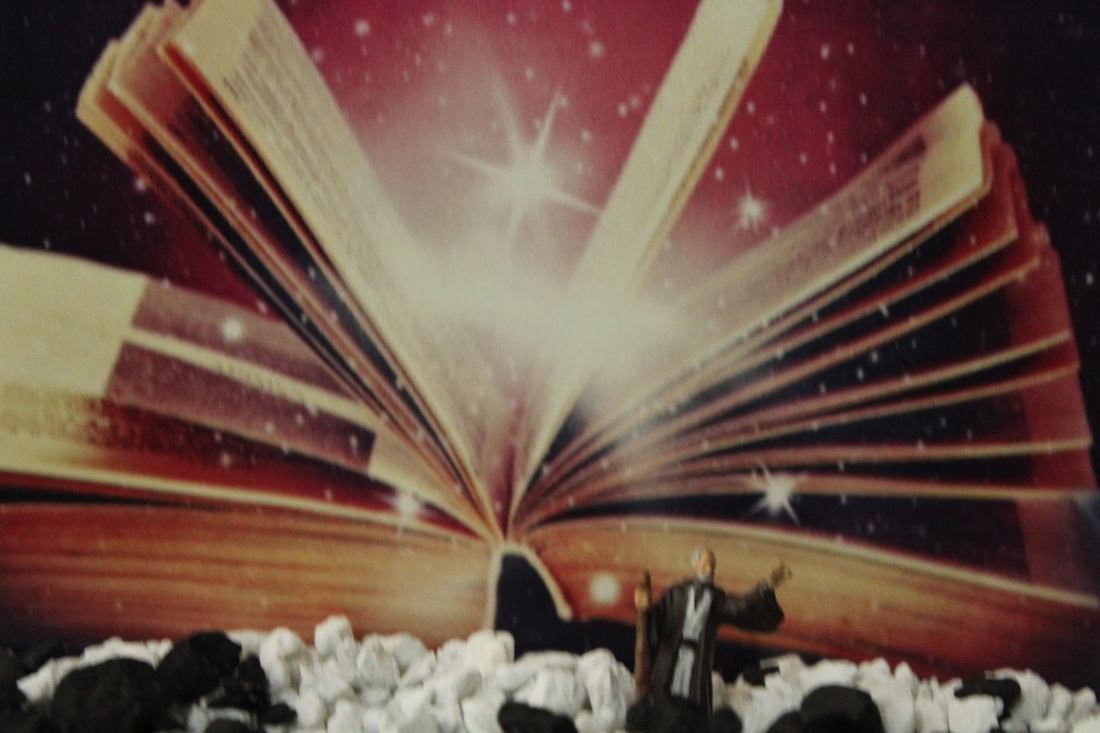
This is my least favourite picture by slinkachu as you can barely see the miniature people. He should of zoomed in and maybe used a different aperture setting on the camera to create the blurry background effect to make it stand out more.
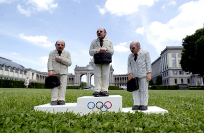
My personal favourite...
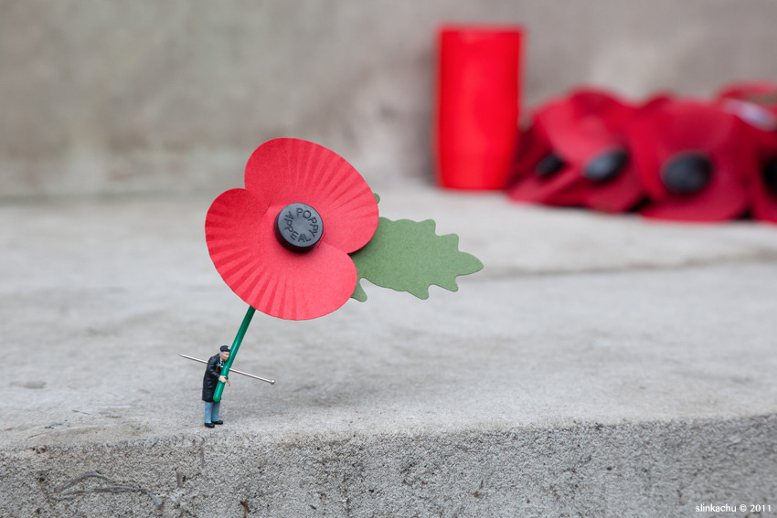
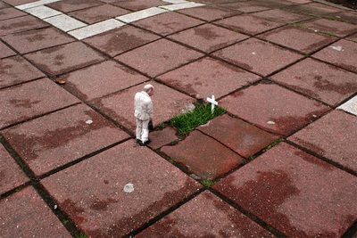
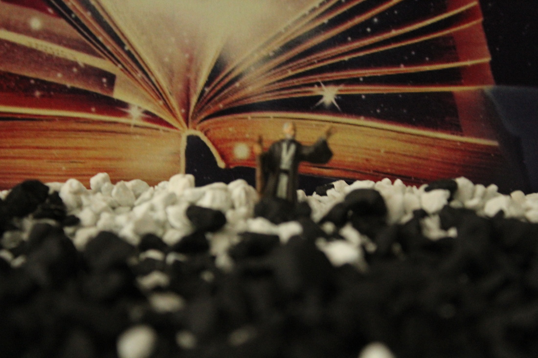
This is my favourite photograph because it represents Remembrance Day. This reminds me of people who died and how sad many families were so this is special. This represents Remembrance Day by including the poppy under the mini figures arm implying that he’s sorry for all of those lost soldiers.
I done research that links to slinkachu and I found a person who does similar photography.
A little Bit of research ~ Isaac Cordal.
Isaac Cordal (born 1974) is a Spanish artist whose work involves sculpture and photography in the urban environment. He lives between Brussels and Galicia. Cordal was born in 1974 in Pontevedra, Galicia, Spain. He studied at the University of Fine Arts Pontevedra, degree in sculpture. He studied for five years at the School of Canteiros Pontevedra, a school dedicated to the conservation of stone crafts. He also trained at Camberwell College of Arts in London... Isaac Cordal was a founding member of Alg-a.org, digital art community from Galicia. He was part of the artistic collective Ludd34560 and Sr. Pause. He was an active member of the death metal scene in Spain, publishing the fanzine Exorcism and playing guitar in the band Dismal

The difference between Slinkachu and Isaac is that Slinkachu adds empathy but Isaac Cordal adds fear.
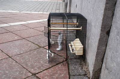
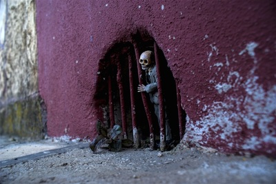
My personal favourite...
My personal favourite is this photograph because Isaac has used a wall vent to make the figure look like its in-prisoned.
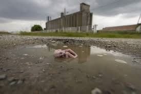
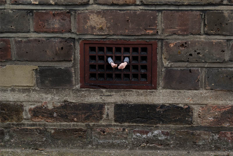
I am not very fond of...
|
I'm not very fond of this photograph from isasc cordal as it just looks like a man lying down and there is no story to is. However, I like the way the people are blurred out in the back ground to put the figure in focus.
|
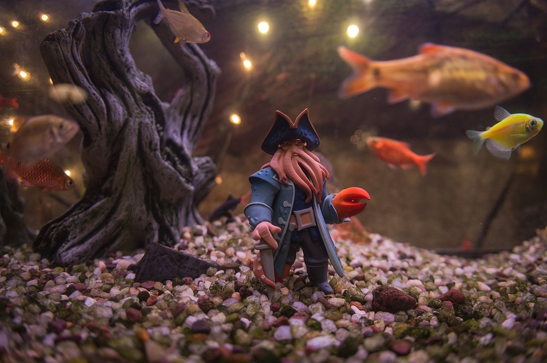
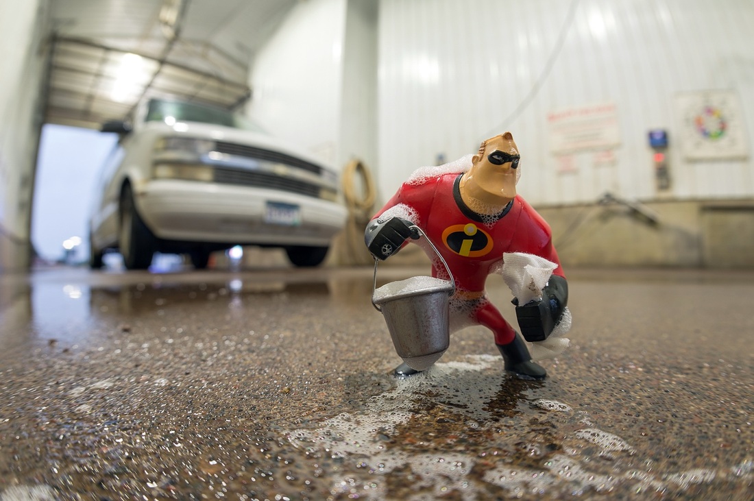
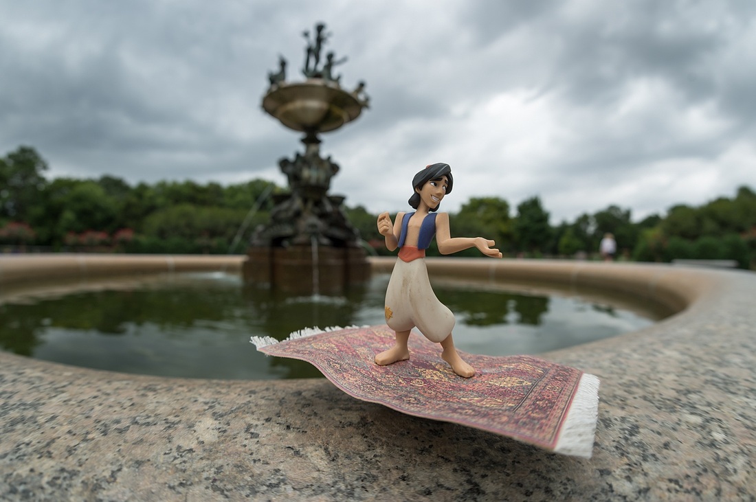
A Little more Research ~ Kurt Moses
|
The relation between Kurt Moses and Slinkachu is that they both use figures. However, Kurt uses Disney figures whereas Slinkachu uses small people figures. Throughout the 90's, Moses pursued a career in graphic design. For most of this decade, he spent his time creating websites for different clients up until he left his agency to become a free-lance web designer in 1999. From here, he began to help cut costs for his clients by taking photographs of their products. Little did Moses know that this cost cutting method would lead to his long lasting career in photography. In 2004, he took the plunge and became a full time photographer and after an unstable start, in 2010 he launched his first photography project- Un Petit Monde. This on-going project has enabled him to create miniature life across the globe.
|
Kurt's Photography...


I am not fond of...
|
am not fond of this photograph because it isn't focused on the figures, there is a wide aperture which means Moses is using a smalldepth of field that shows everything in the background but i think this would look better as a low depth of field to present the figures more. |
My personal favourite
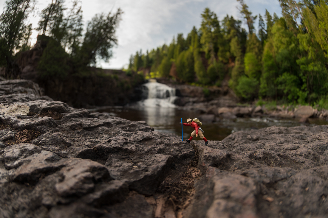
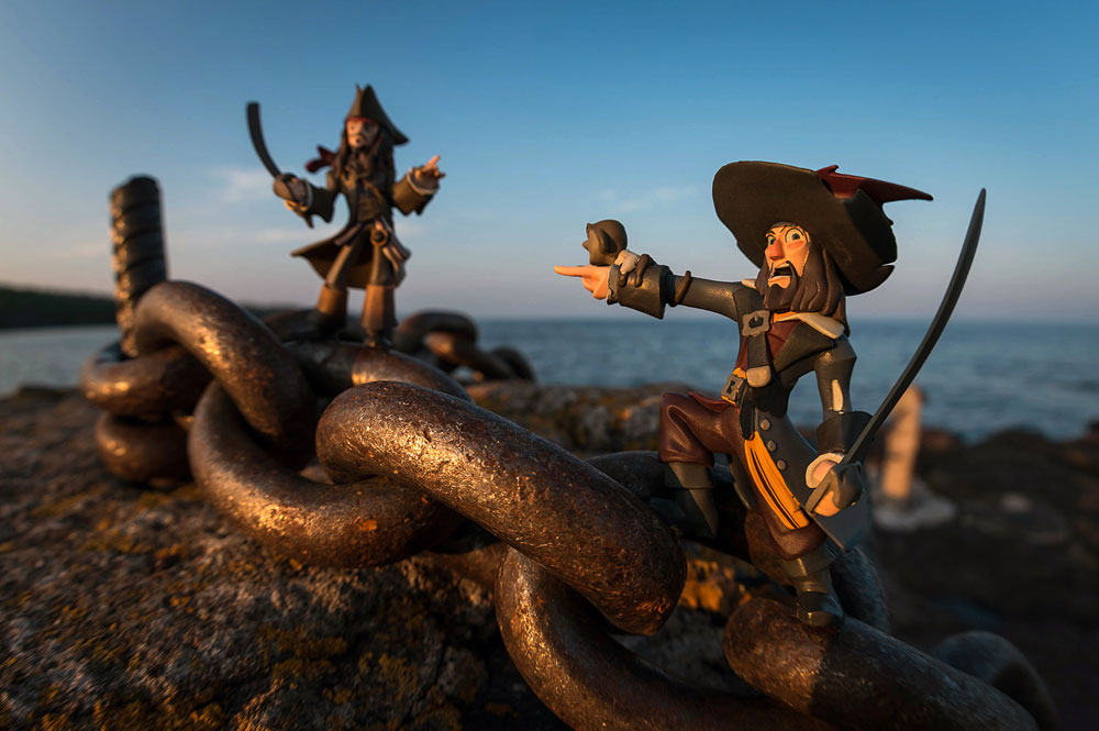
This image does not have a large depth of field but it doesn't have a low depth of field either its in-between and f/5 maybe f/3 so that the background is blurred but not completely to not see what is behind and shows the figure and its surroundings clearly. The focus is mainly on the figure and its surroundings simply implying the figure is on an adventurer focused more on the destination rather then what' going to happen next. Also, I like the way Moses has brought a lot of texture to the rocks in the foreground.
shoot one


i am not very fond of...
|
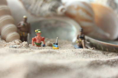
I am not fond of this photo because the focus is completely off the figures apart from the one at the front. This is apparent in the image within the small depth of field that I used. The camera angle has resulted in the clear foreground and out of focus background.
|
|
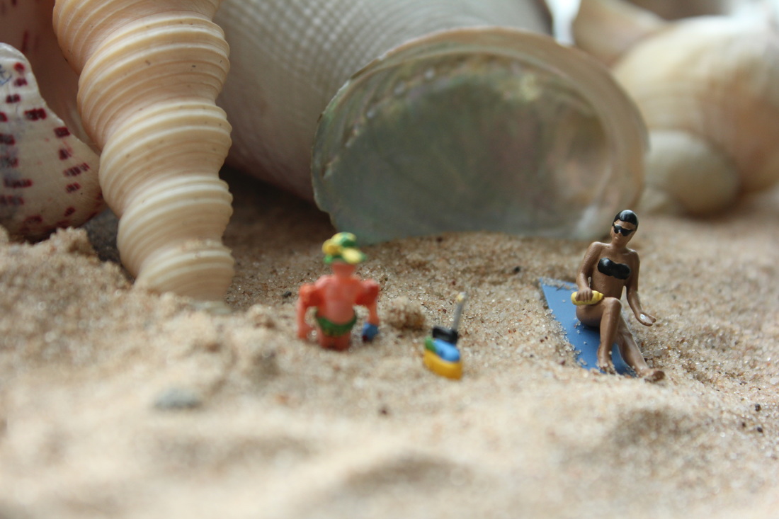
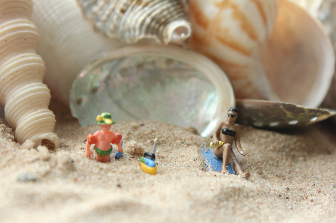
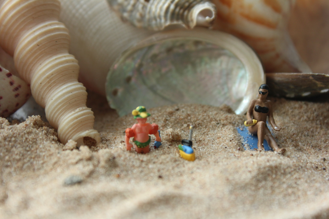
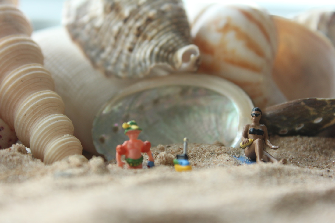
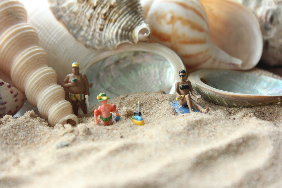
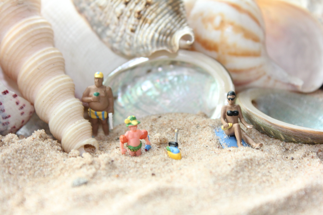
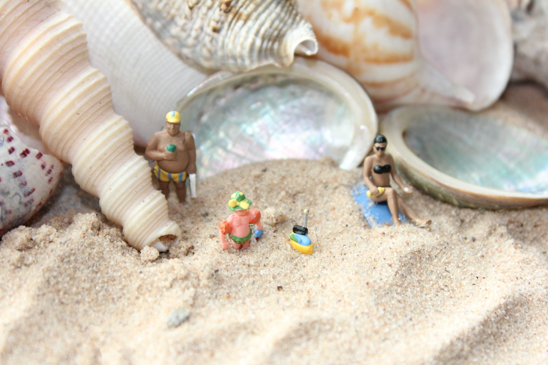
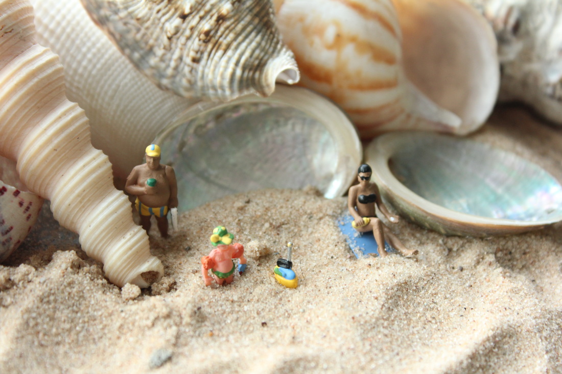
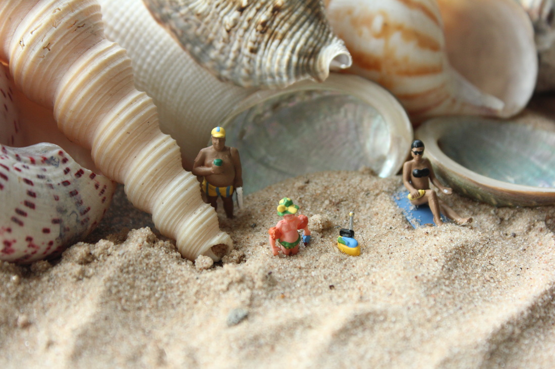
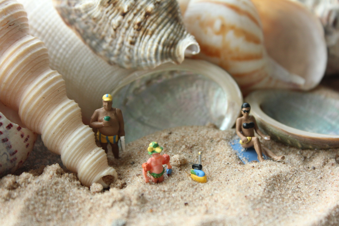
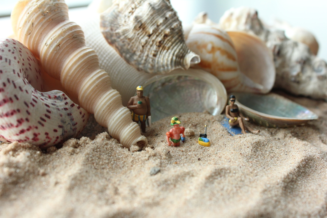
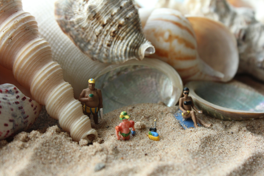
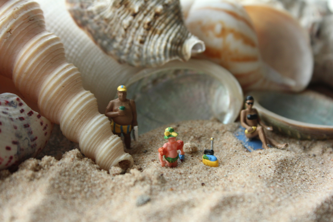
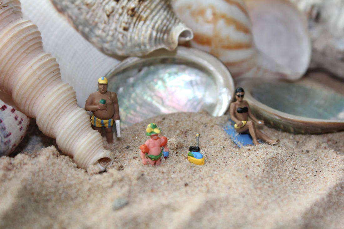
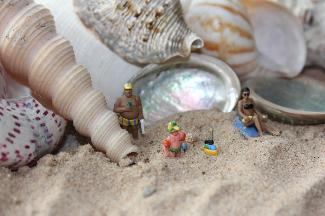
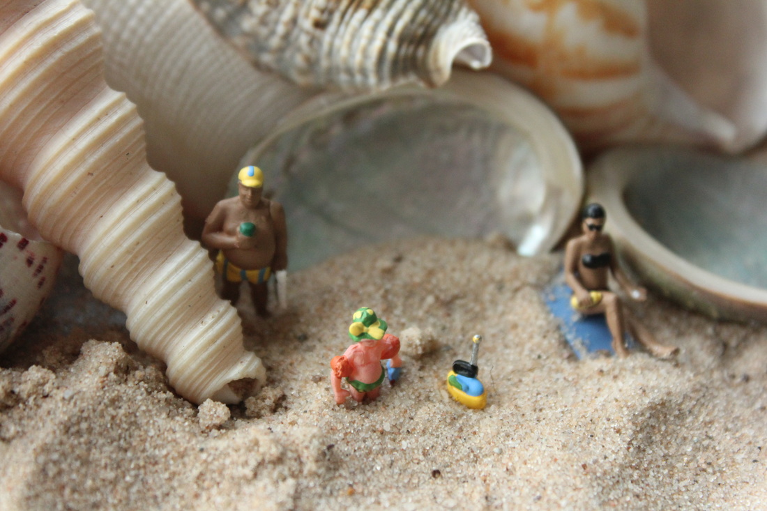
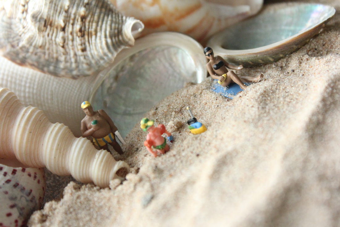
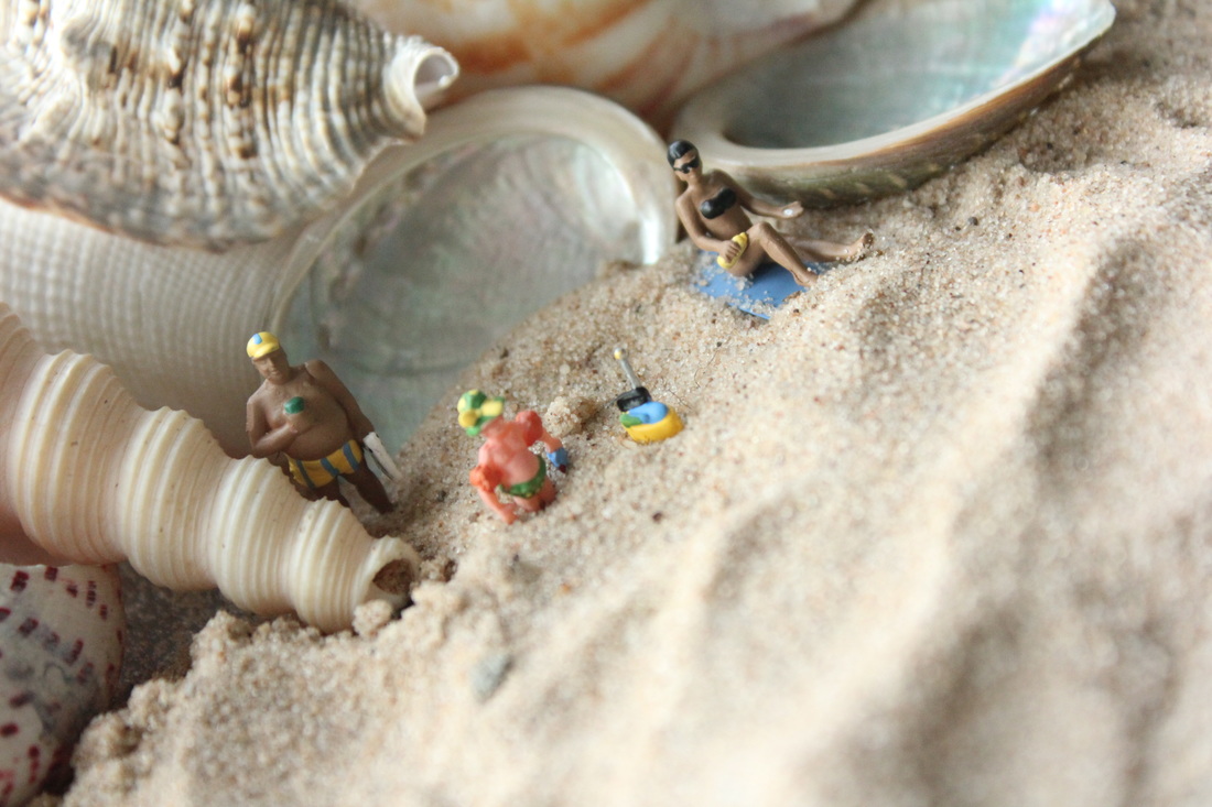
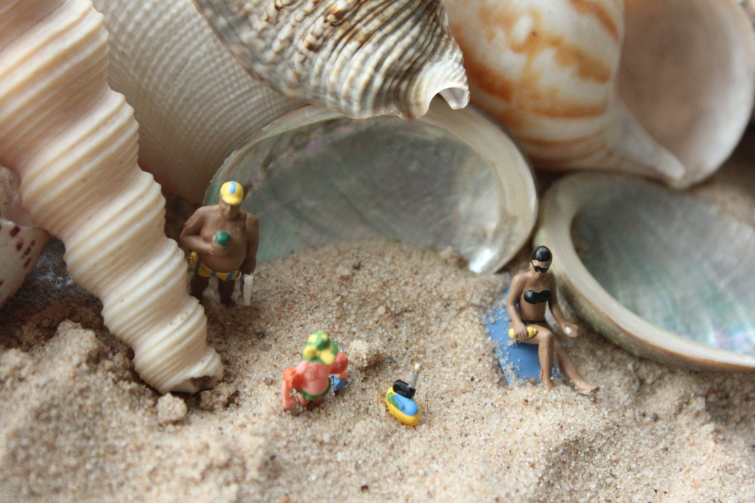
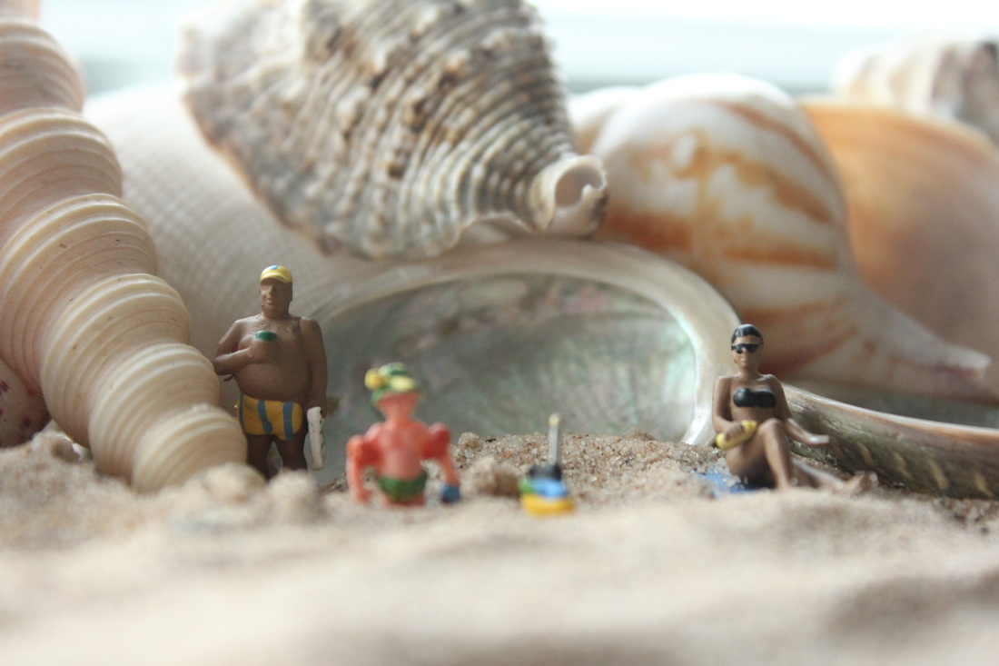
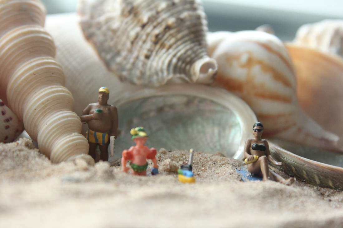
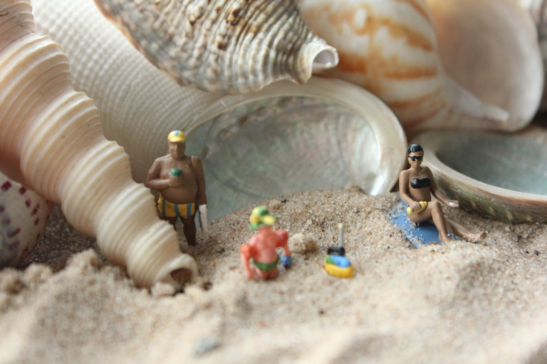
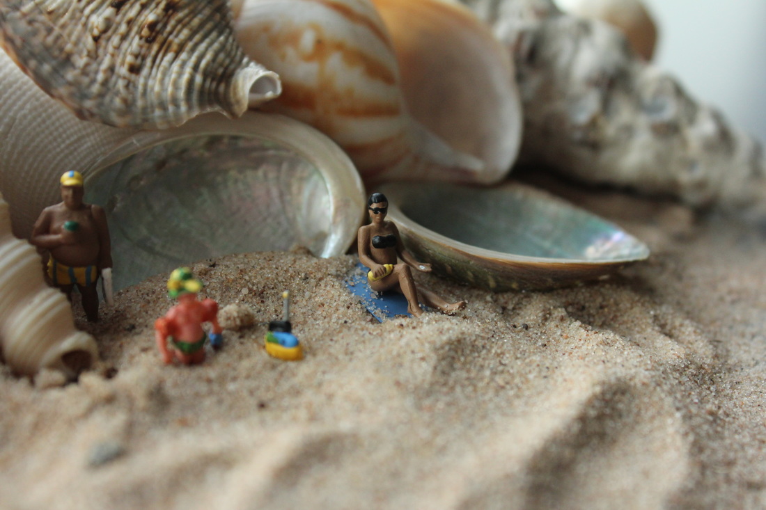
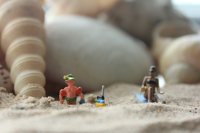
My personal favourite...

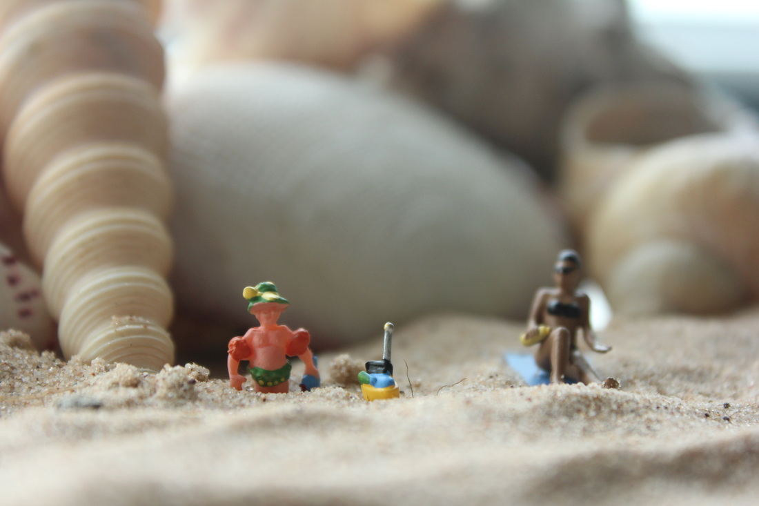
This is my personal favourite because both figures are in focus. The background is out of focus in the small depth of field. The focus is mainly on the figure and its surroundings simply implying the figure s are having a good time at the beach.

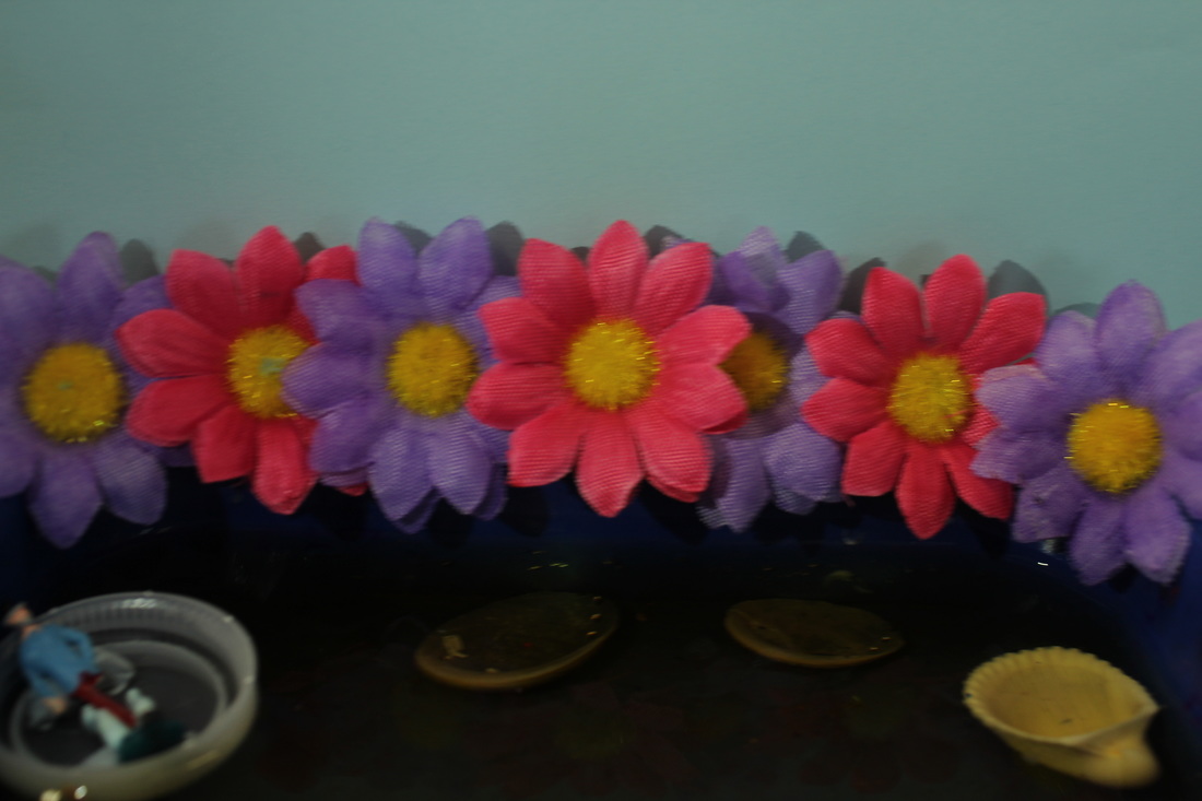
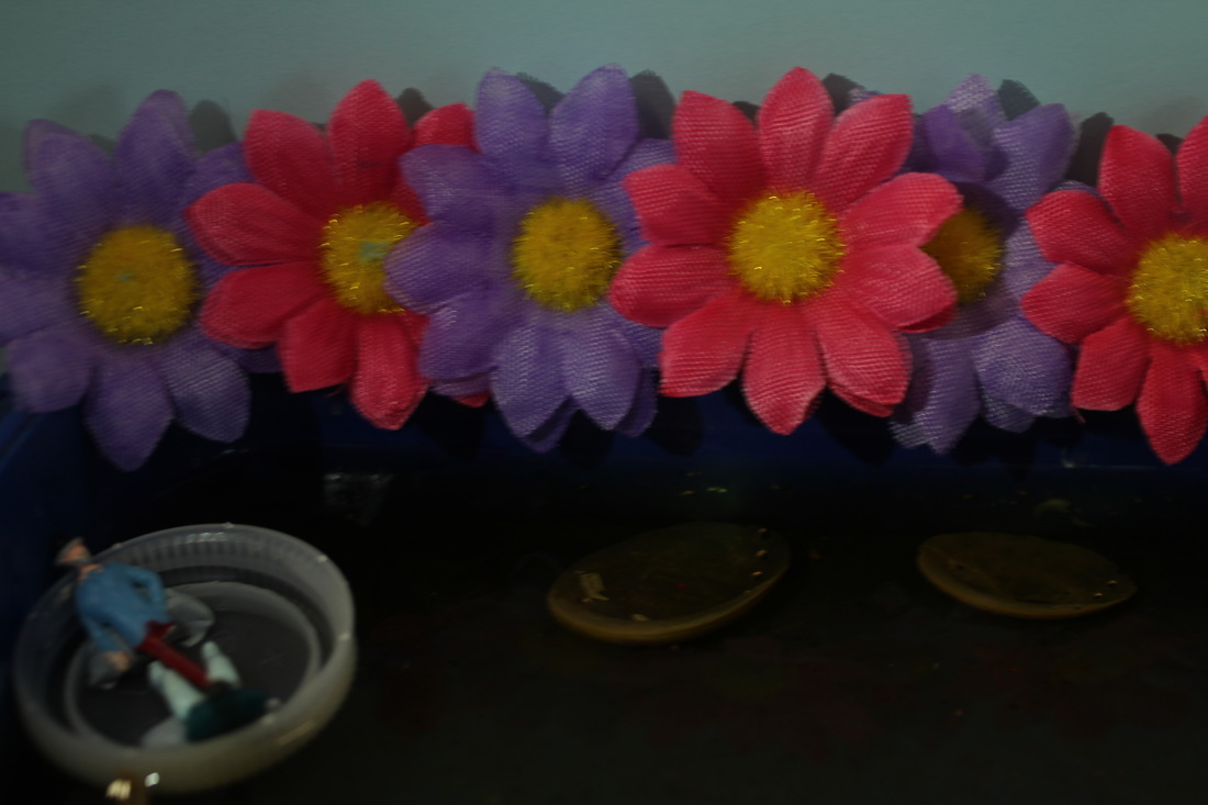
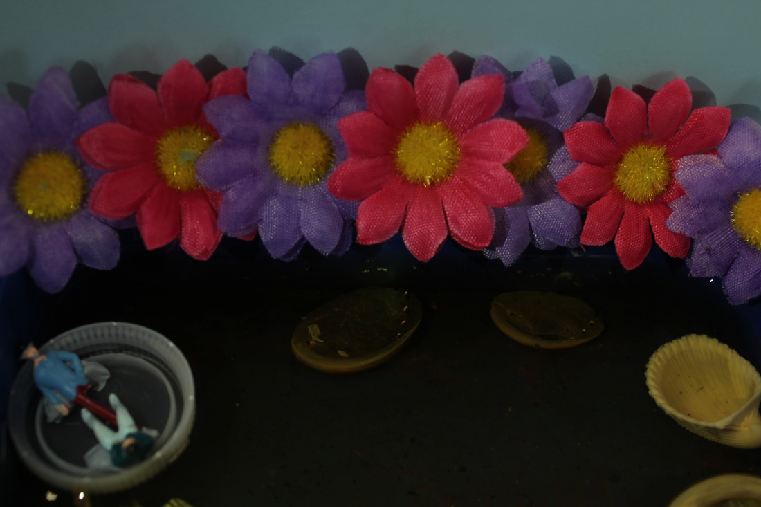

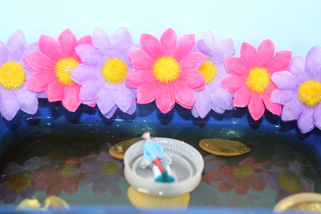
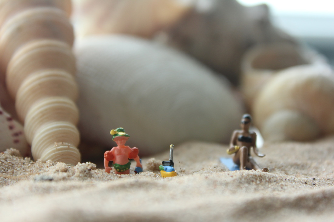
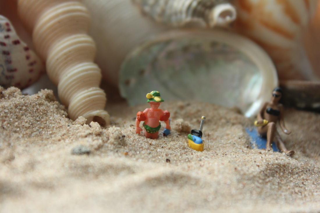
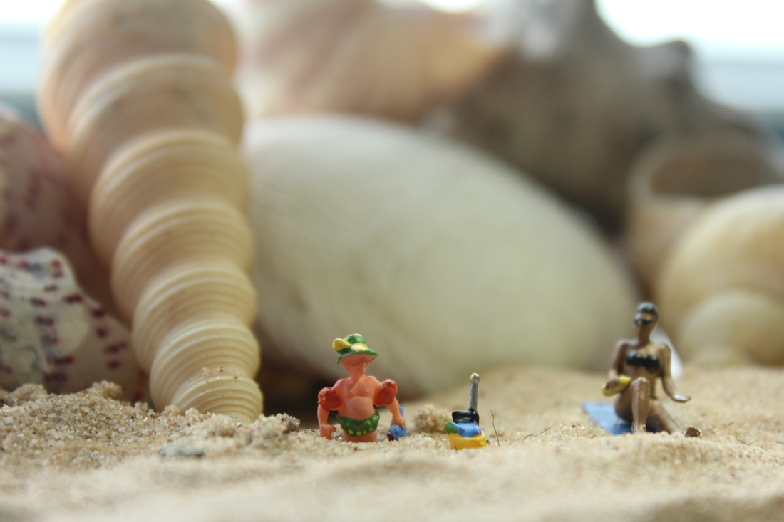
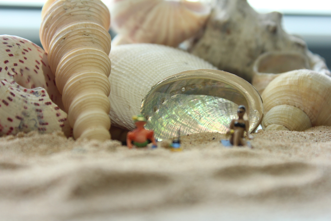
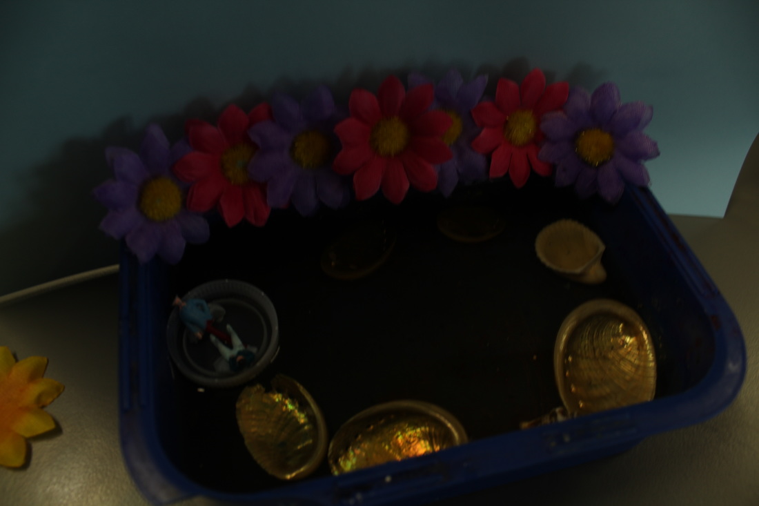
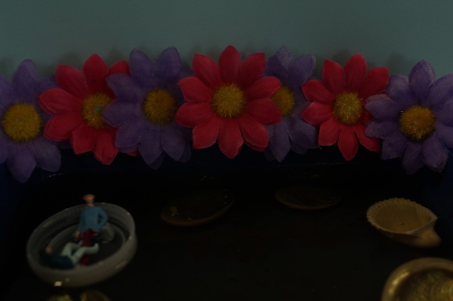
This shoot is about a couple who are going on a boat ride (bottle lid) through a pretty lagoon. The props I used was; shells, paint box, bottle lid and little flowers. I used a blue piece of paper for a background.
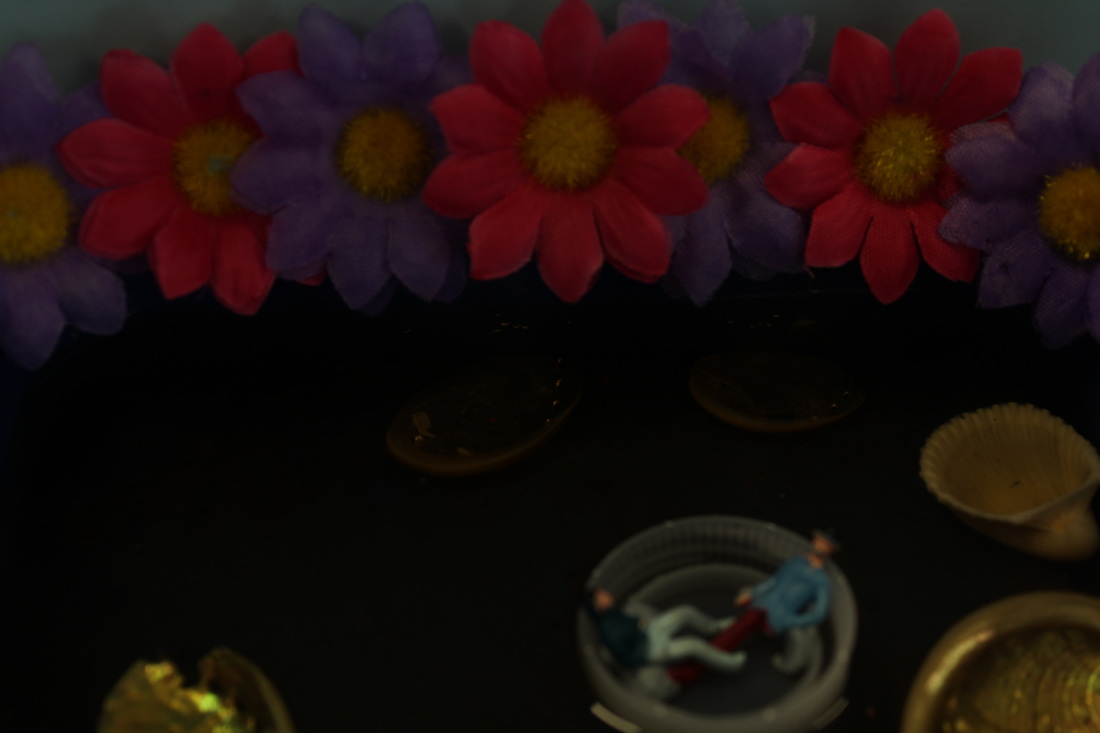
I am not very fond of...
|
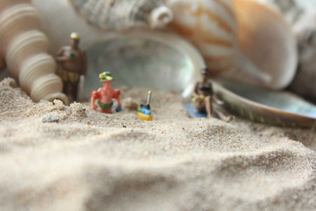
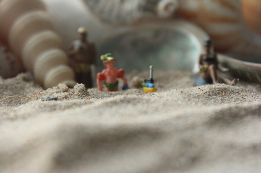
This is my worst photograph from my shoot. Firstly, the exposure used within the shoot is completely off for the effect that I was trying to create overall. Using a dark exposure typically creates a sense of darkness and dismay however, this shoots exposure is way too dark to imply any form of meaning. The elements and props used within this shoot are hard to work out as the darkness has washed out the colours used within these objects.
|
|
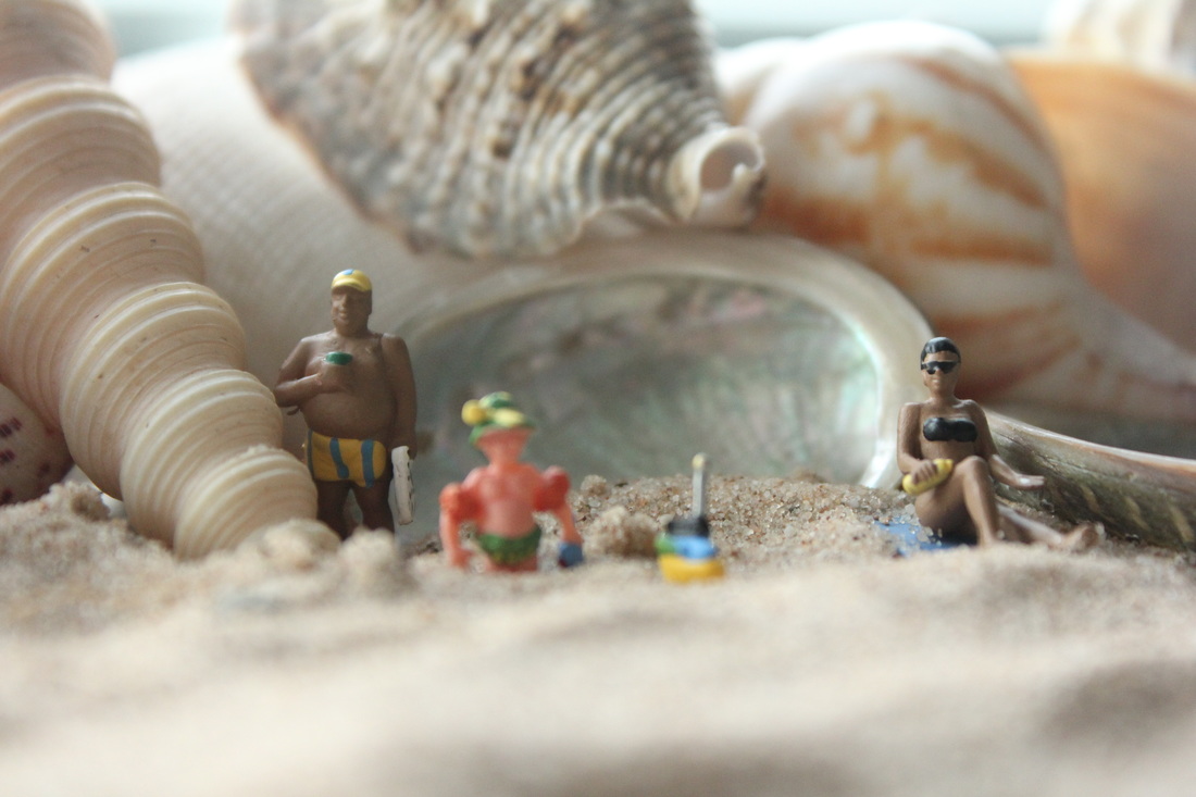
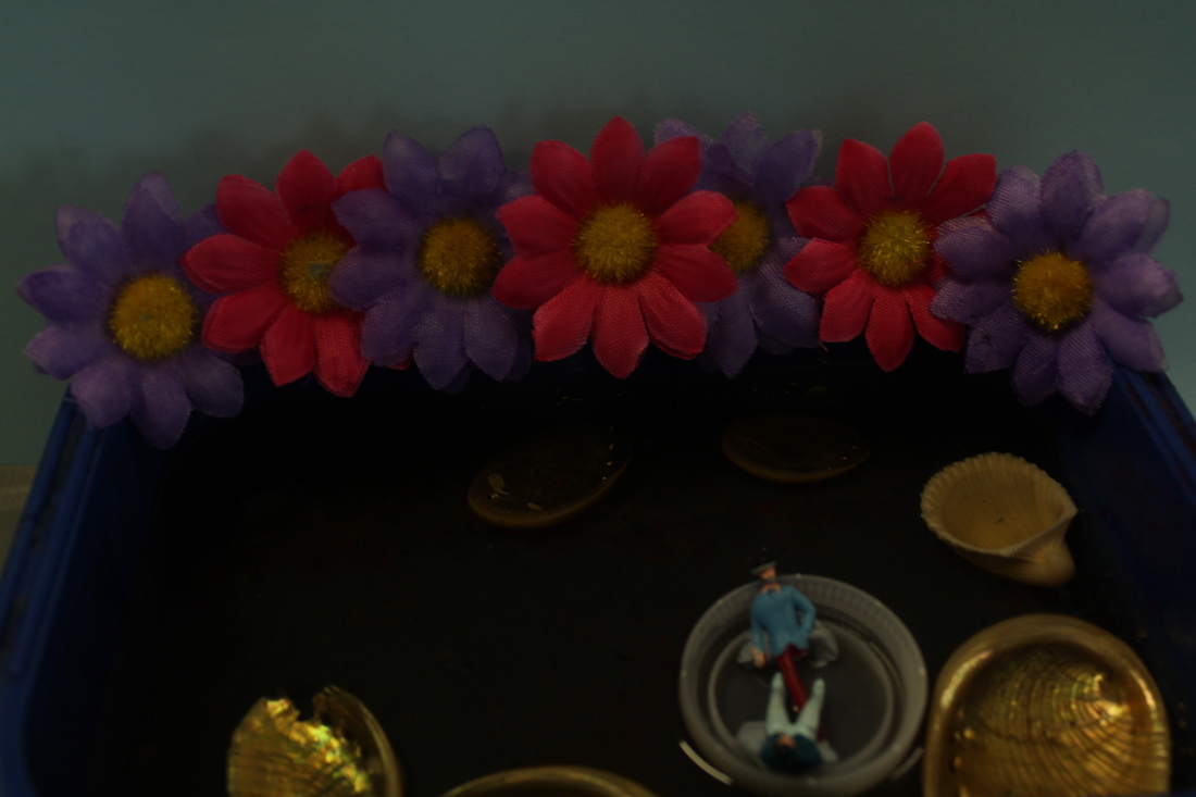
My personal Favourite...
his is my best photograph from my shoot. I think this because the exposure is not as dark in comparison to the other photos within this shoot. You can see the people and you can see what the scene is. This has resulted in a nice scene of two people on a boat ride and you can just see what's going on. However the photograph is under exposed in comparison to what I would like the photograph to look like.
Shoot two
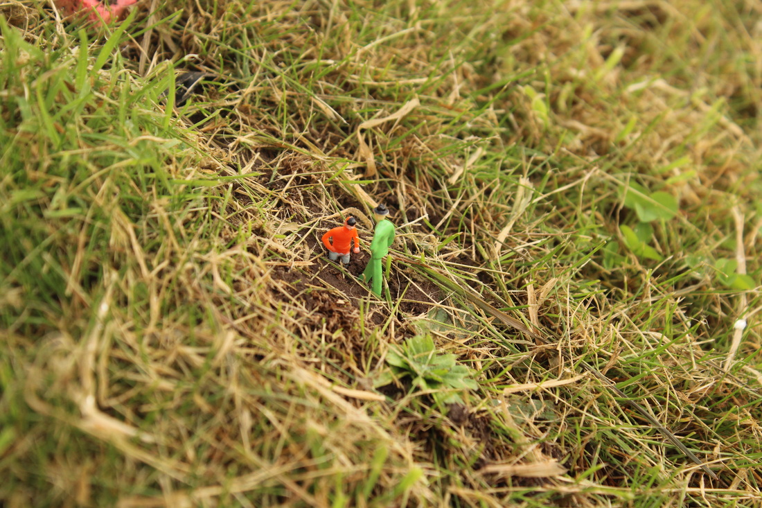
in shoot two I decided to do a forest kind of shoot. I would use a different aperture, maybe F4.5. I will do it at a worms eye view but will try different views to see which is best. I'd like to use the grass to create the effect of trees.
I am not very fond of...
|
This is my worst photograph from my shoot. I think this because the photo is completely out of focus and not on the scene of the image I was presenting.
|

This is my best photograph from my shoot. I think this because the exposure from both the camera settings and the outdoor lighting has created an overall sense of happiness. You can see the people and you can see that the man is stuck in the mud. I feel the focus point within this image is directed towards the figures which insure that the audience knows the vocal point within the image.
Shoot Three
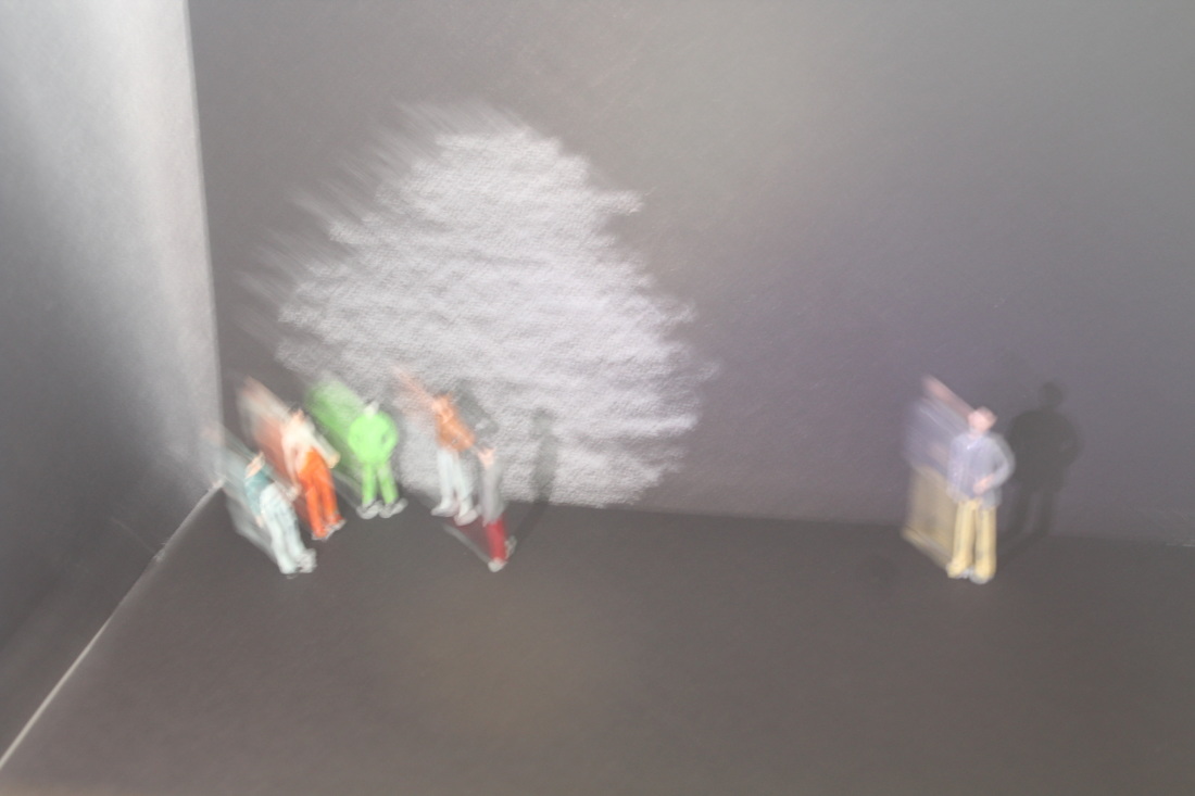
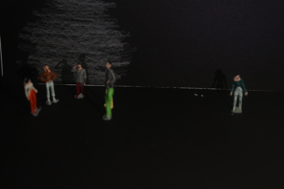
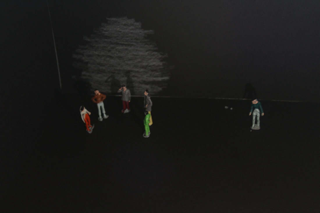
In shoot four I decided to do an outcast kind of theme where the figure is lonely. I used my phone light to shine on the group of people and tried to focus on the lonely figure at the same time. During the end of the shoot I tried different apertures to make the scene darker.
I am not very fond of...
|
There is not clear focus point which is resulted in the figures looking like there is double. The exposure is too bright within this image which has created a distraction from the other effect I was trying to create. The fact that the image is bright makes the image look as if it is a happy scene when it is intended to be showing the social outcast. |

|
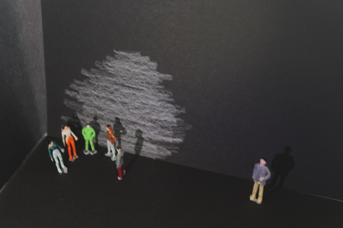
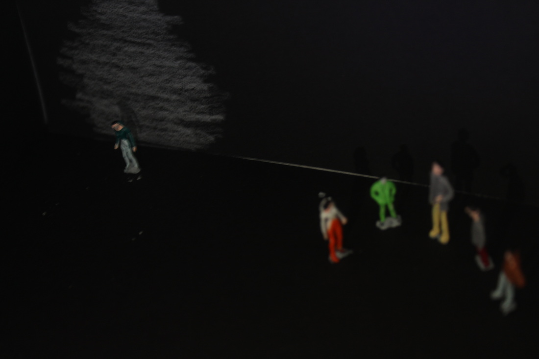
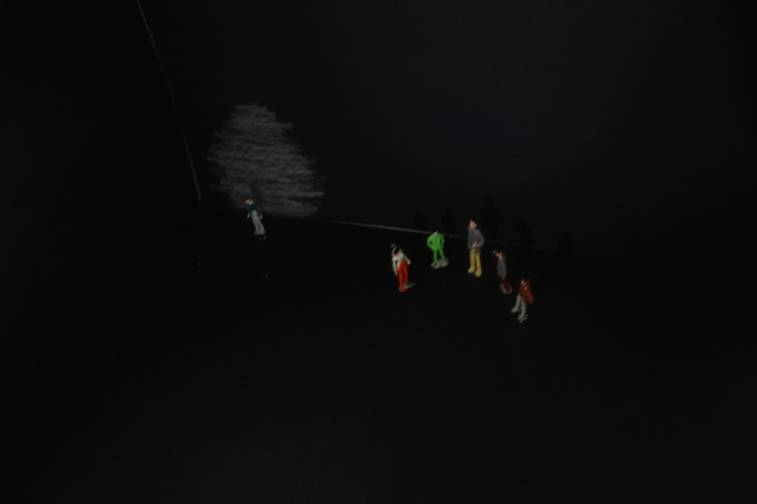
My personal favourite...
I Believe that this image best emphasizes the idea that I desired and discussed in my plan above- loneliness. A low angle shot, implicates a sense of feeling powerless and weak in comparison to everything else in the surroundings.
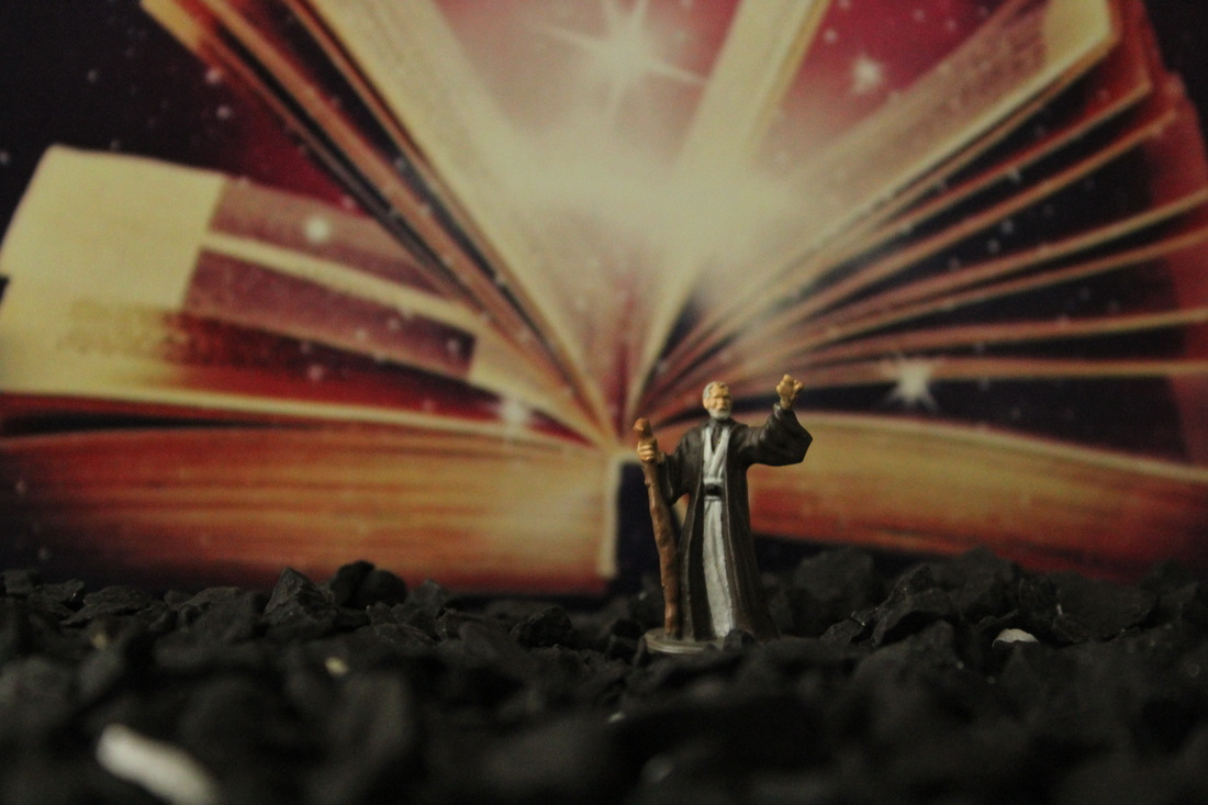
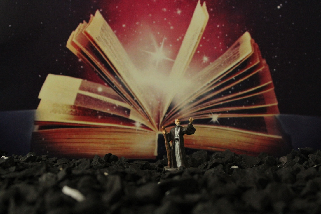
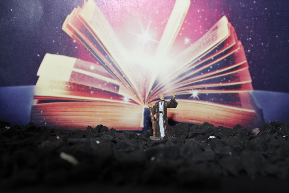
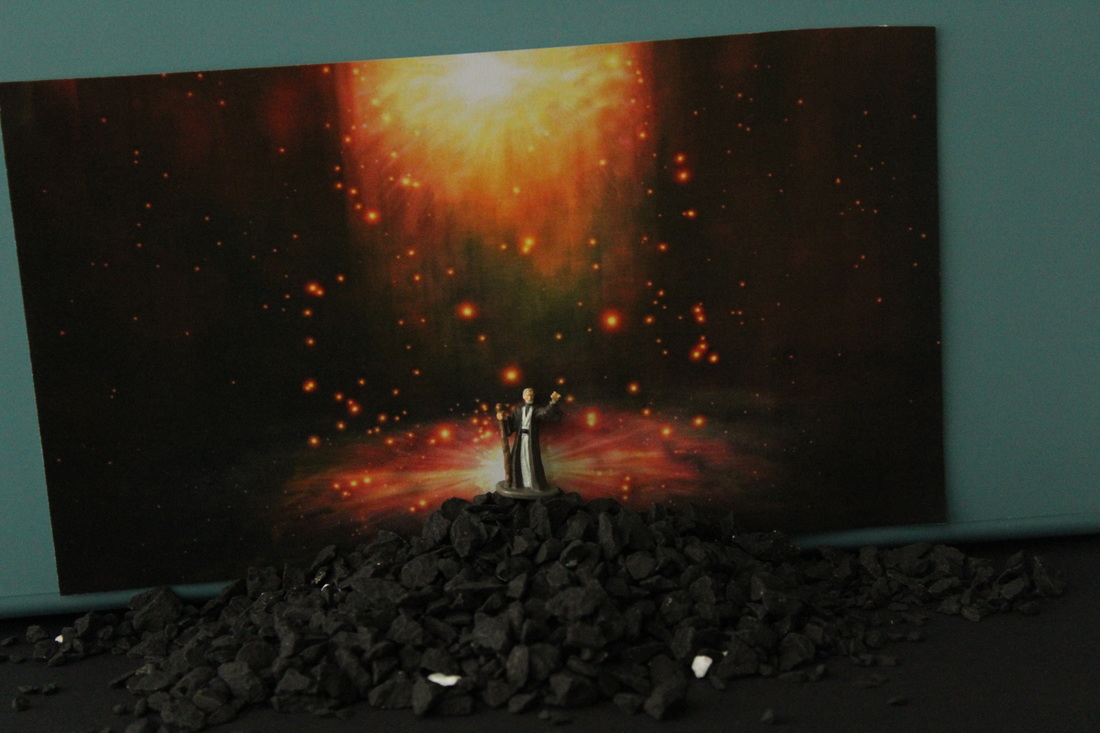
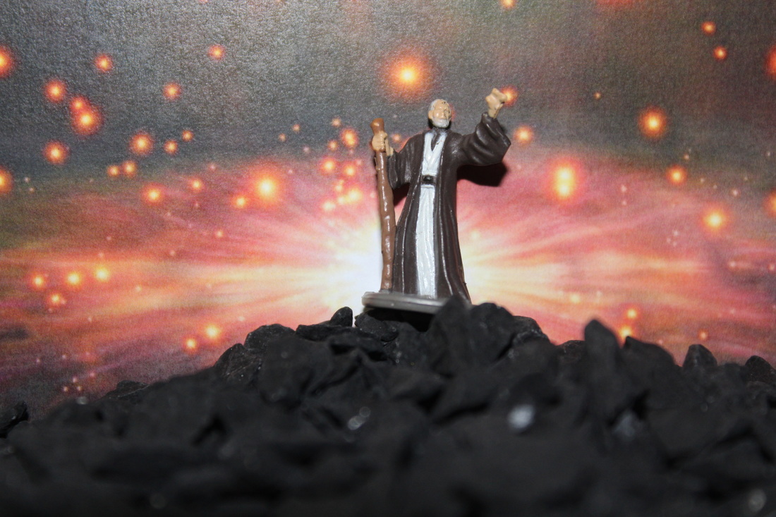
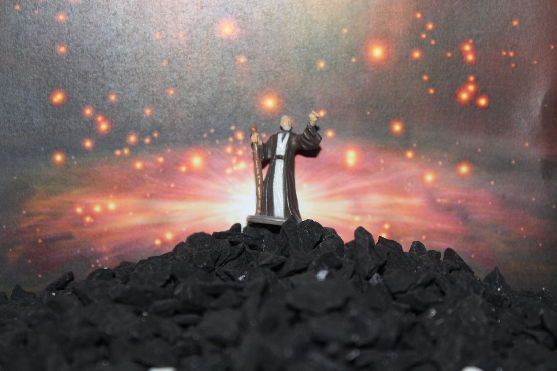
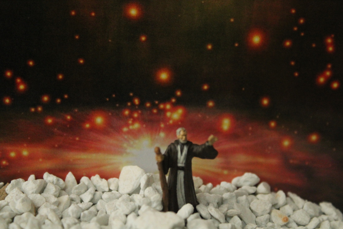
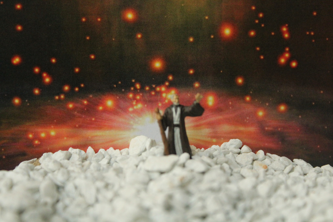
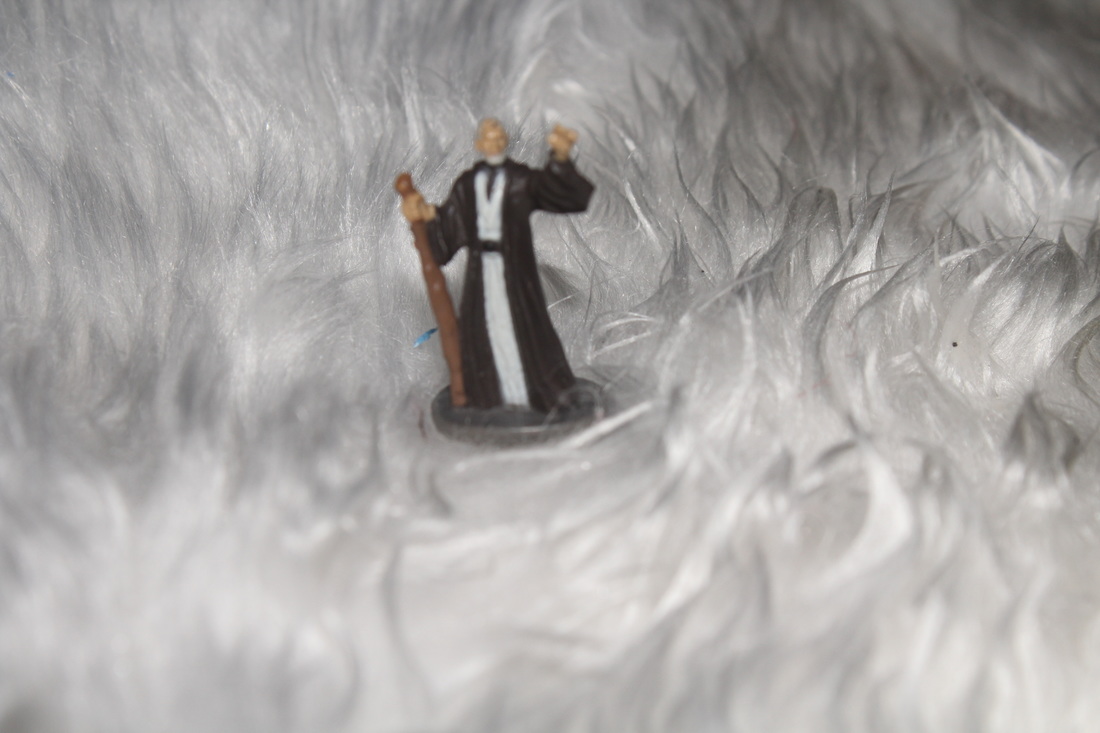
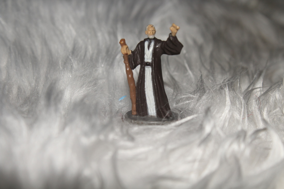
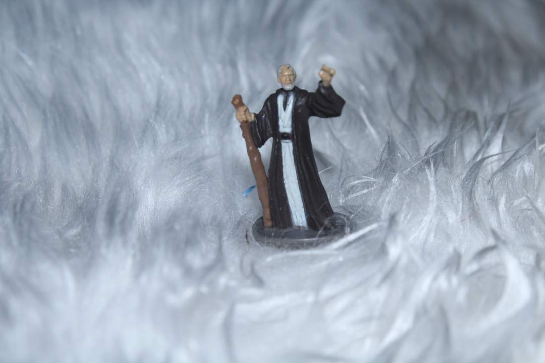
Shoot Four
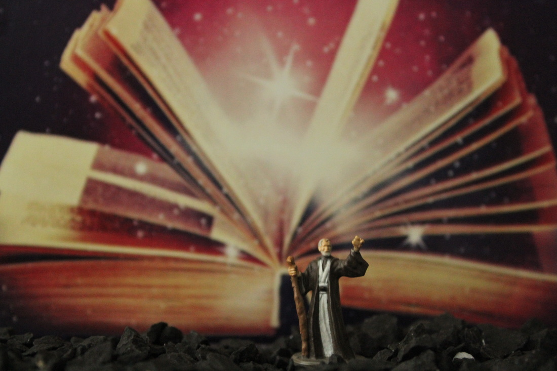
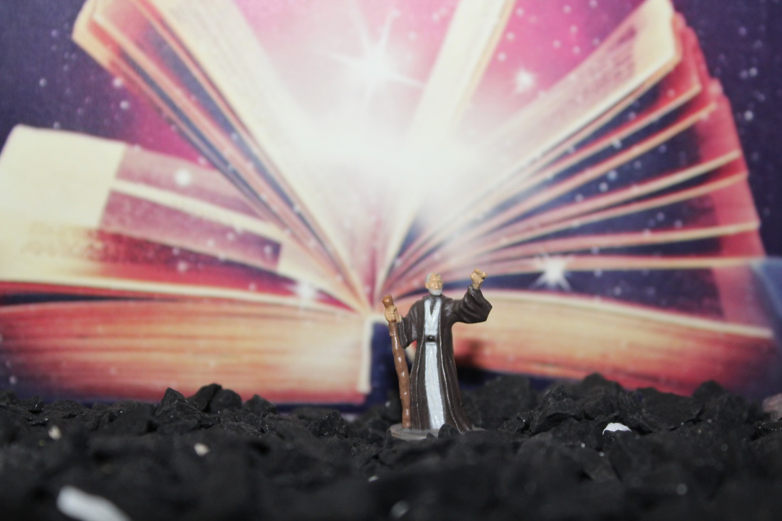
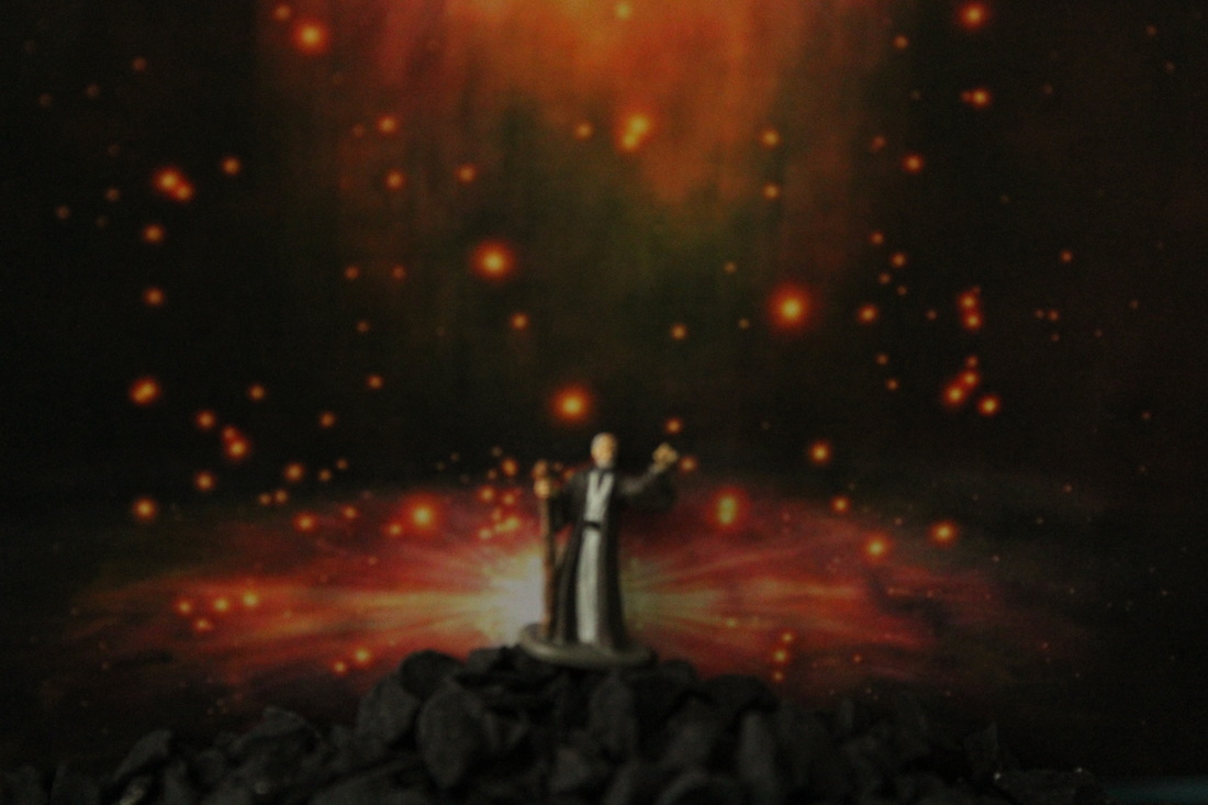
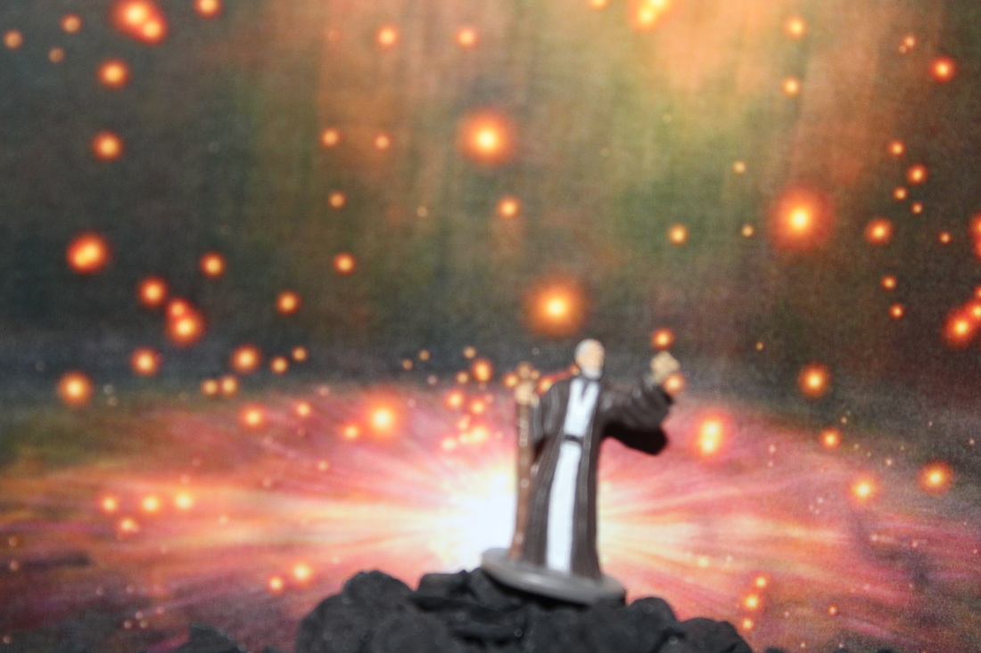
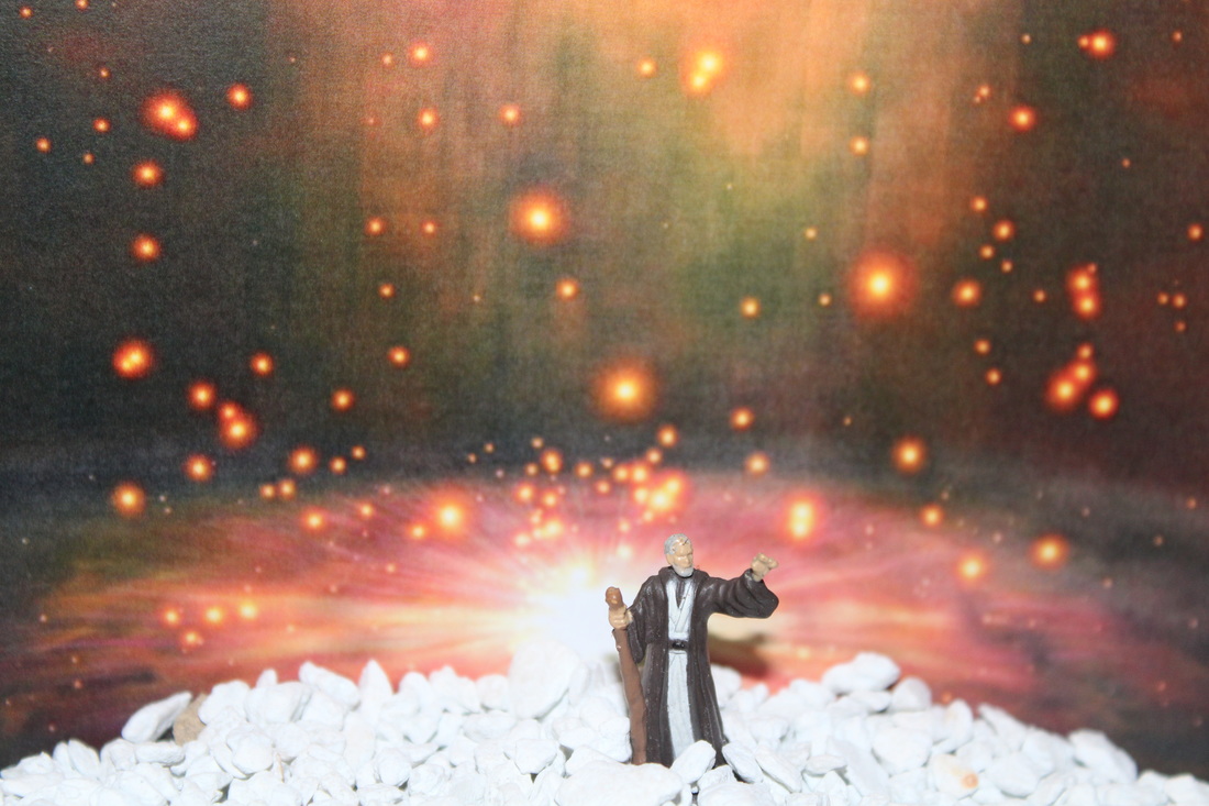
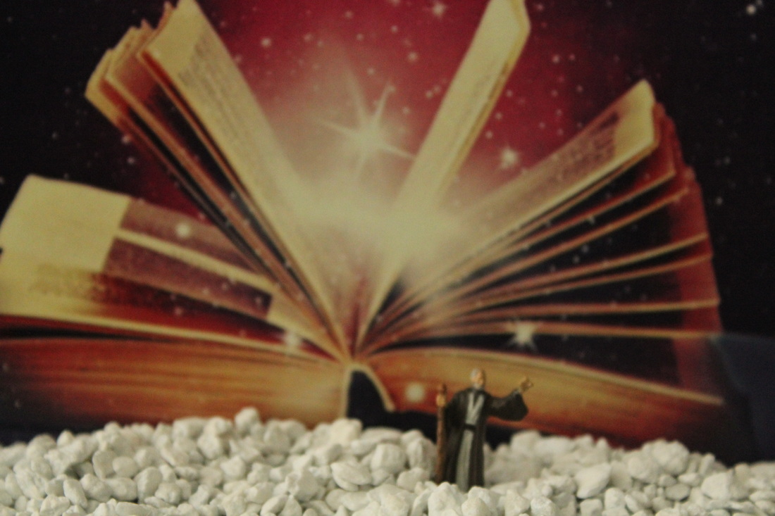


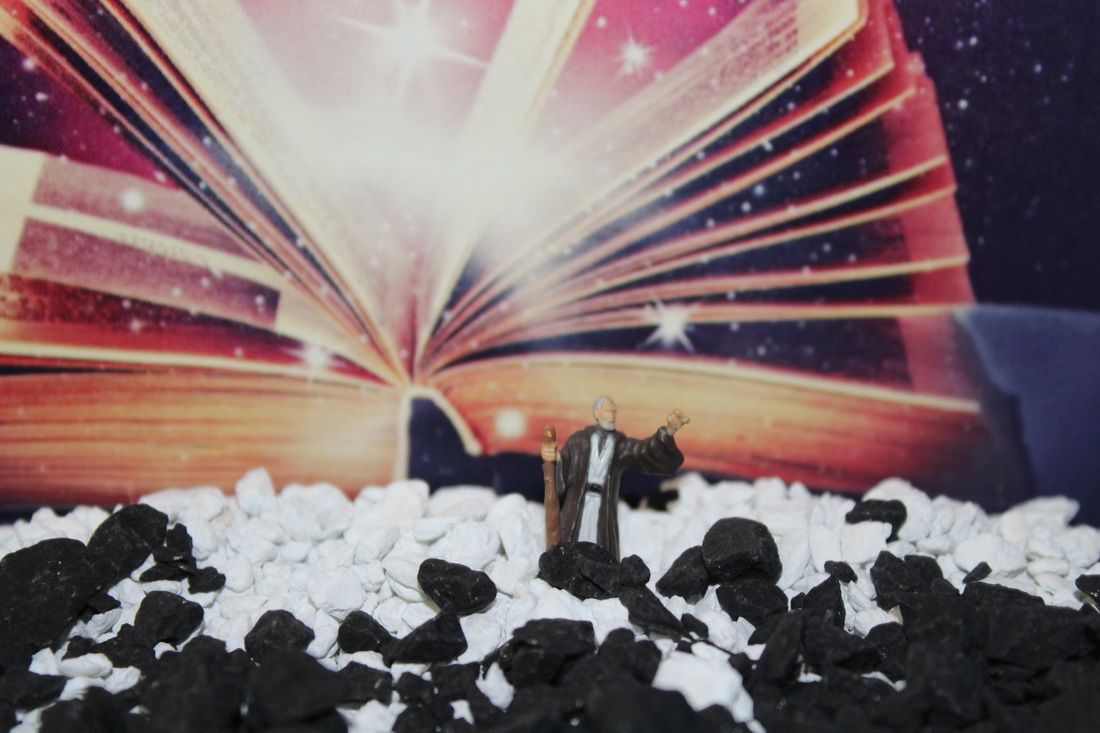
I am not very fond of...
|
This Image has a slightly large depth of field and a high aperture. The high aperture makes the image look bright and a happy image. However, the brightness dims out the character making it blurred out so you cannot see it properly. You can see the4 background more clearly because of this. |

|
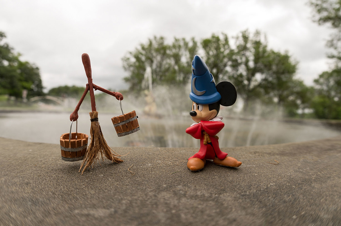
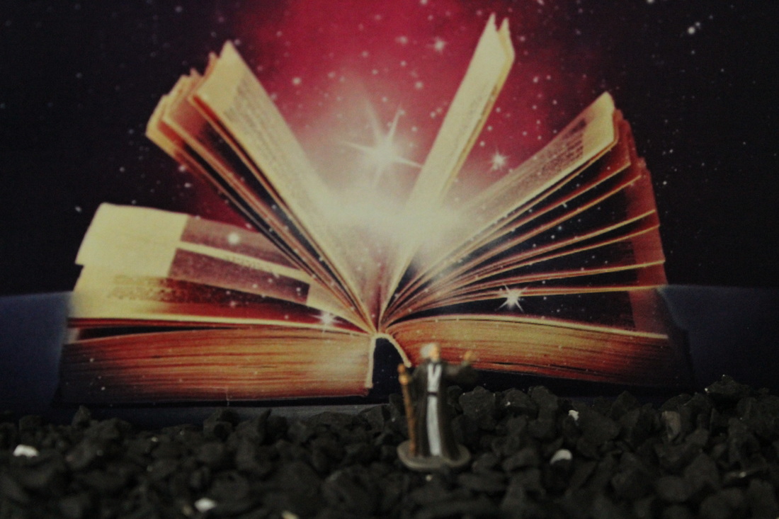
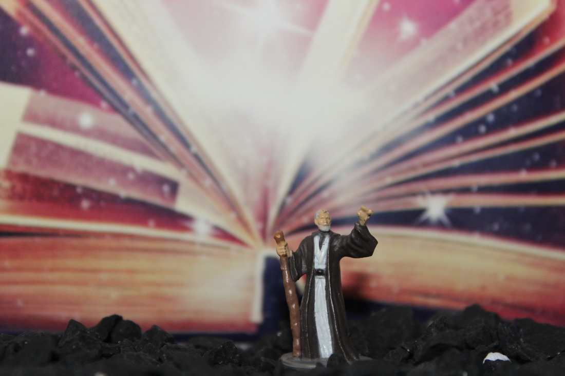
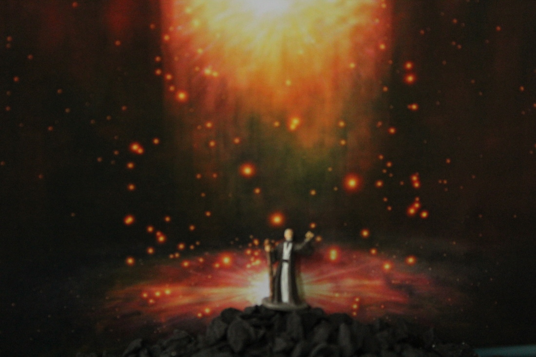
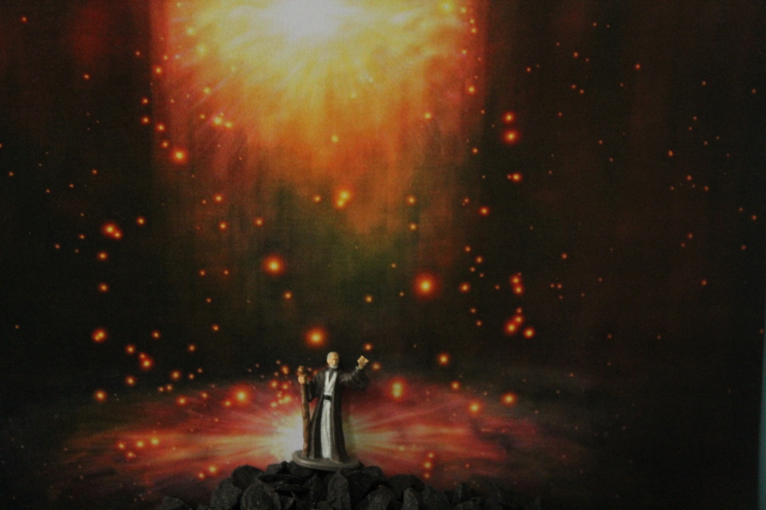
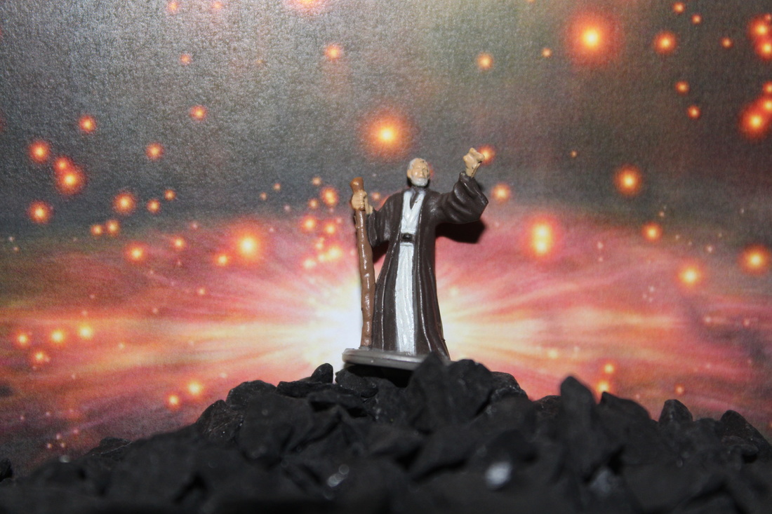
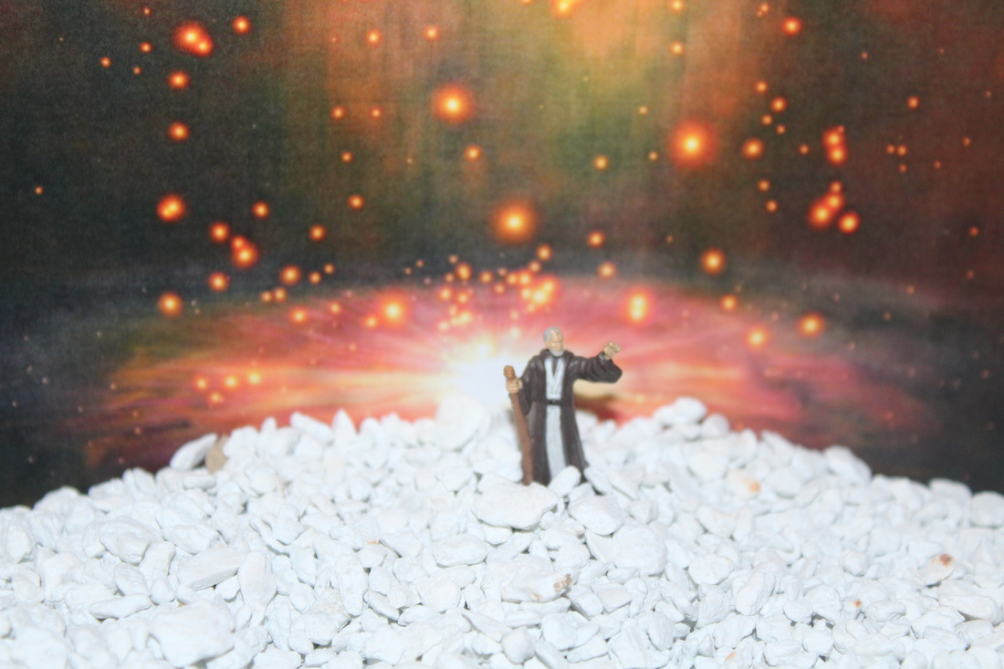
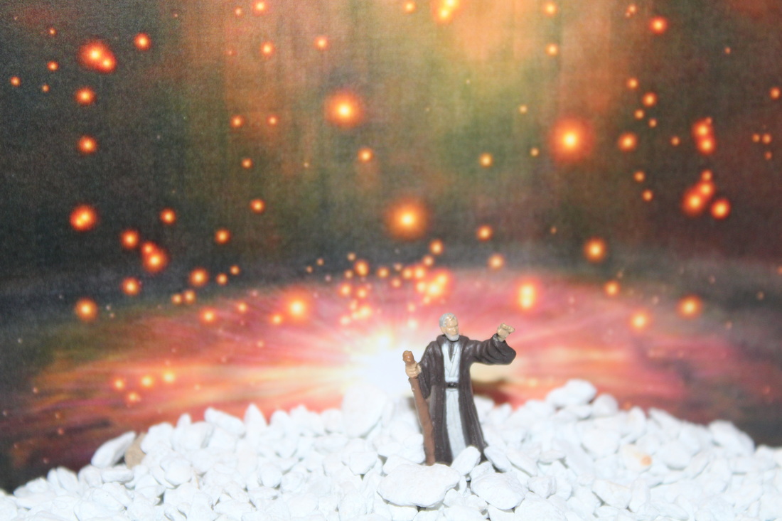
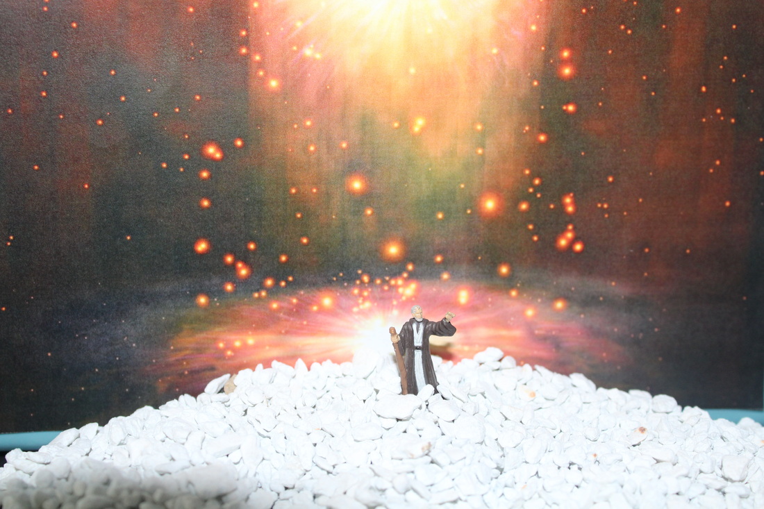
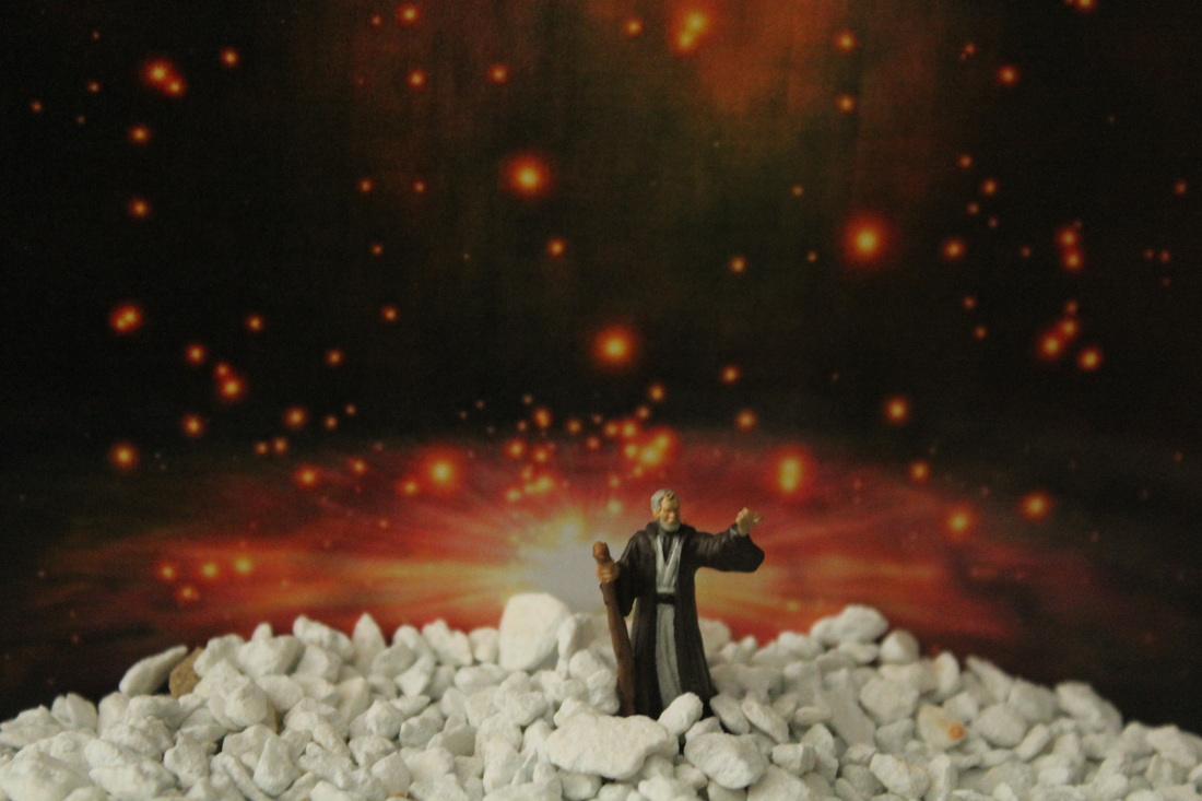
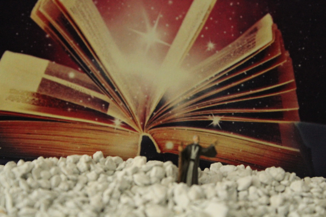
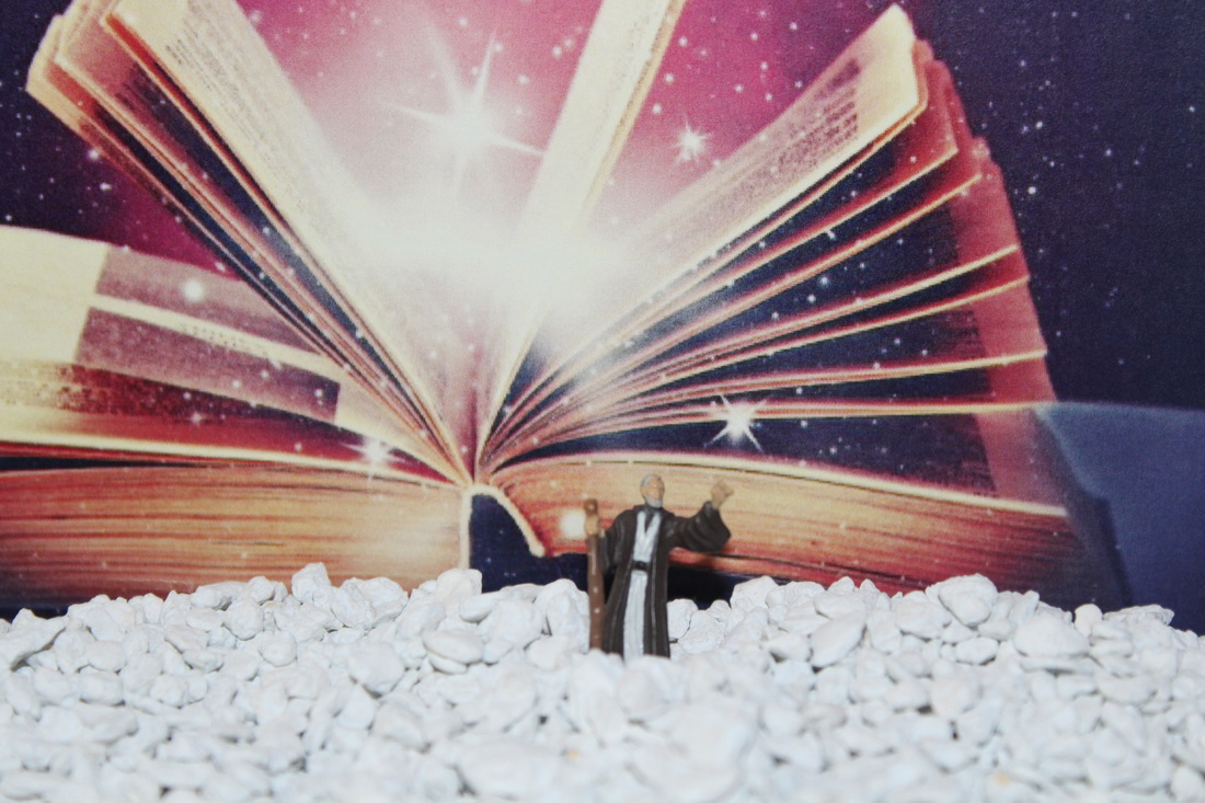
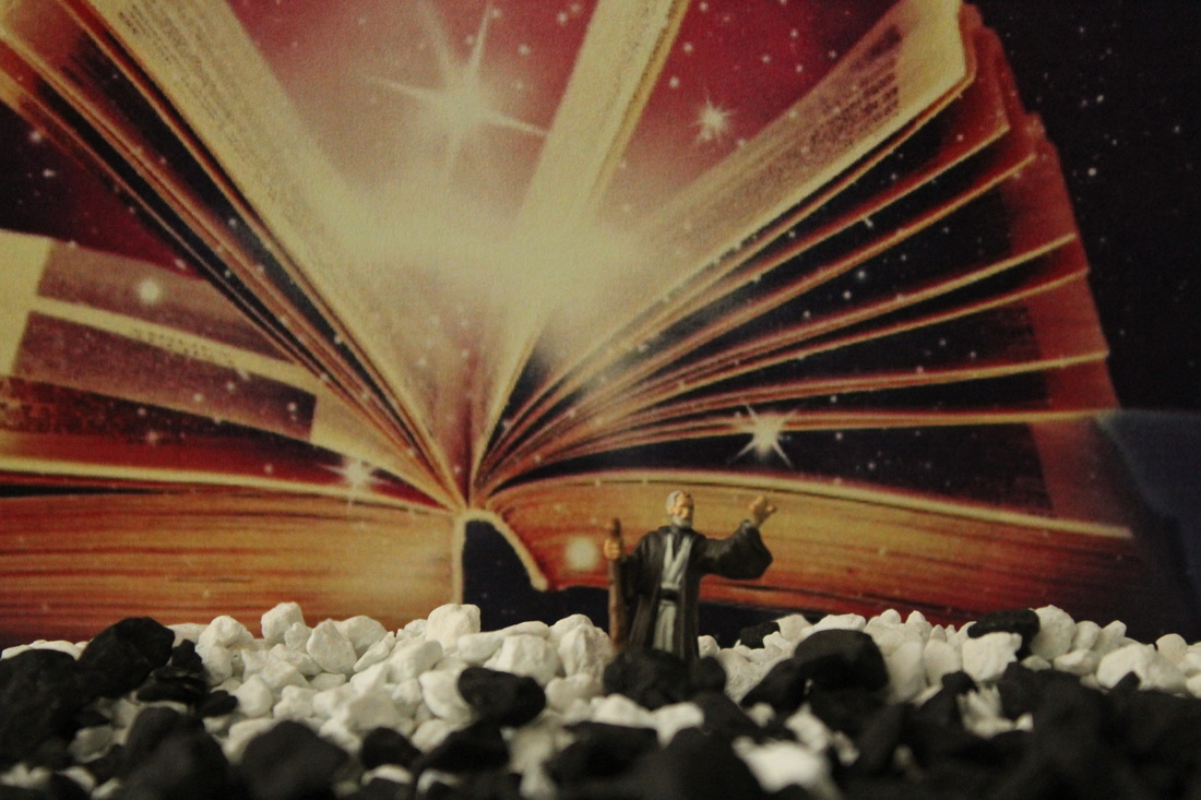
My personal Favourite...

This image has a low depth of field showing the magical background within the image. The background is blurred but not completely to not see what is behind and shows the figure and its surroundings clearly. The focus is mainly on the figure and its surroundings simply implying the figure is on a Wizard character. Also, I like the way this image brought out the texture to the rocks in the foreground.
shoot Five
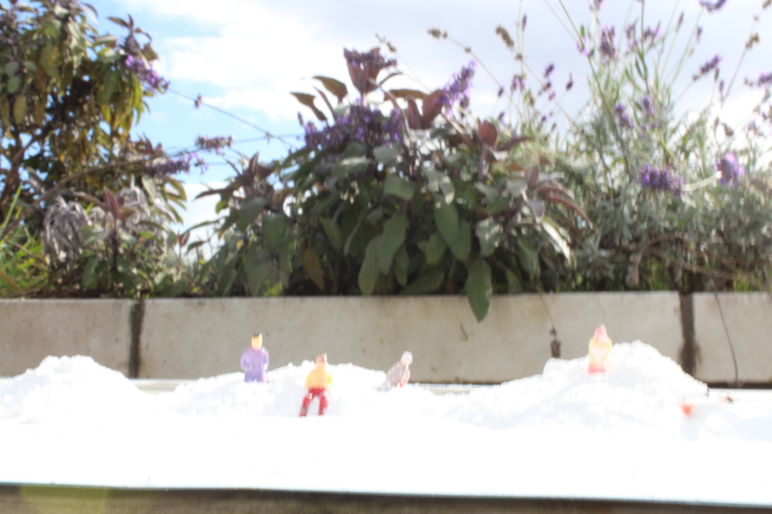
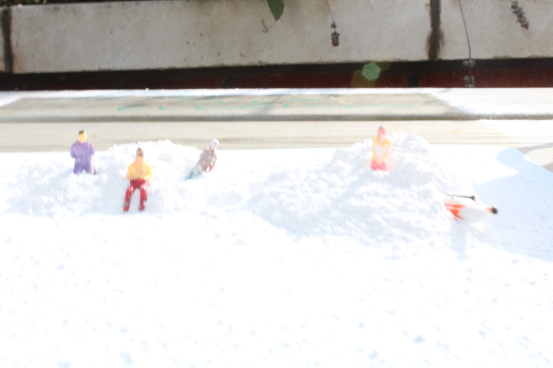
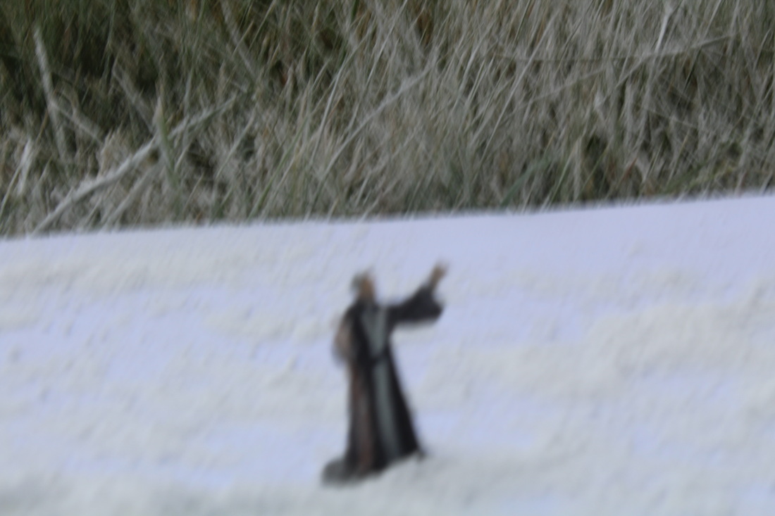
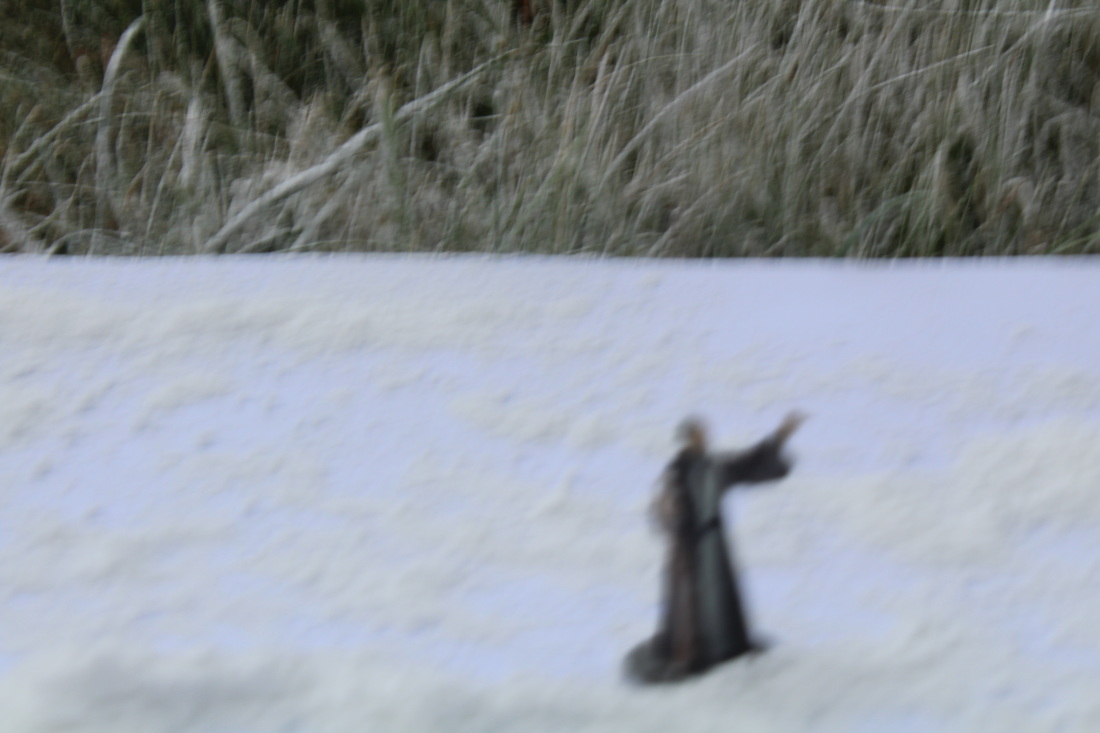
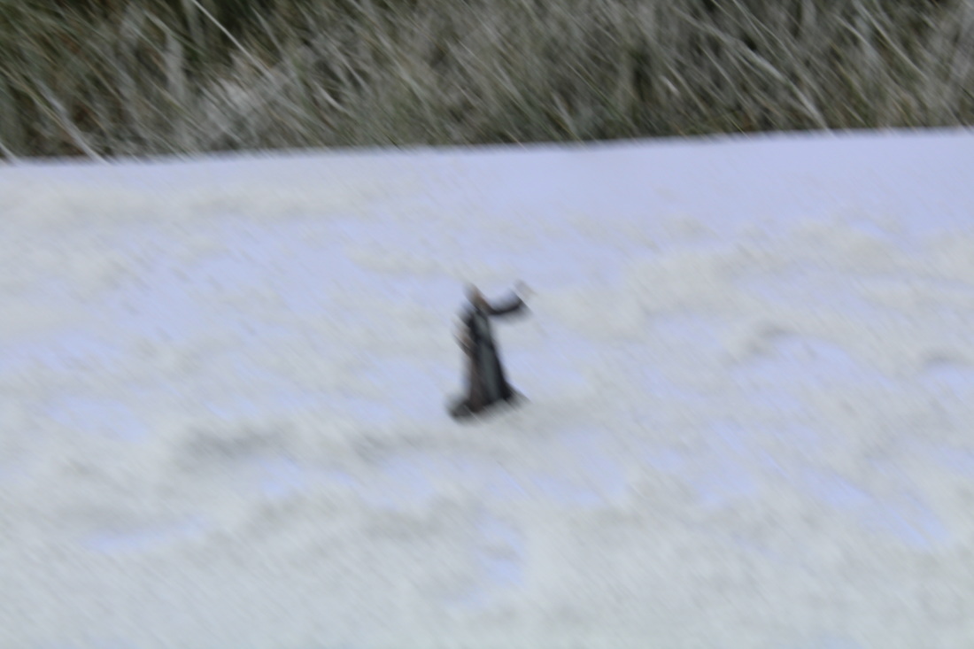
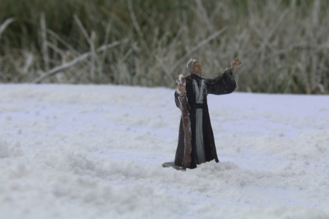
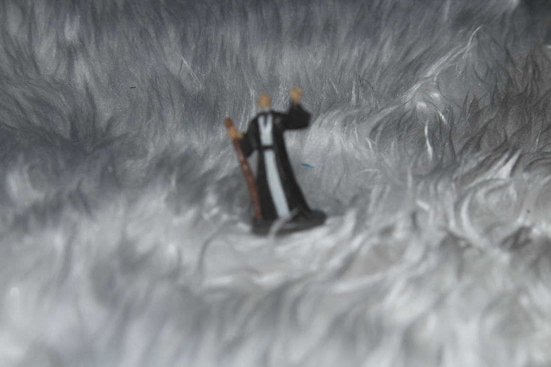
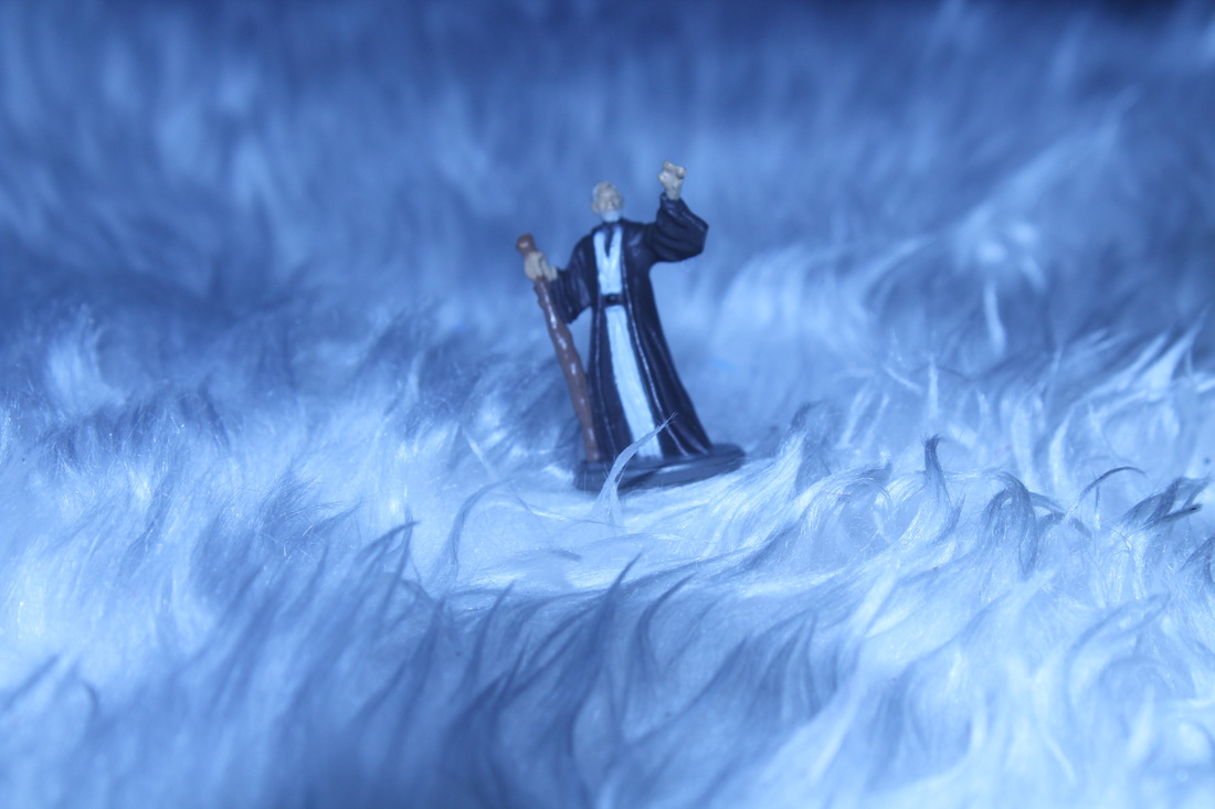
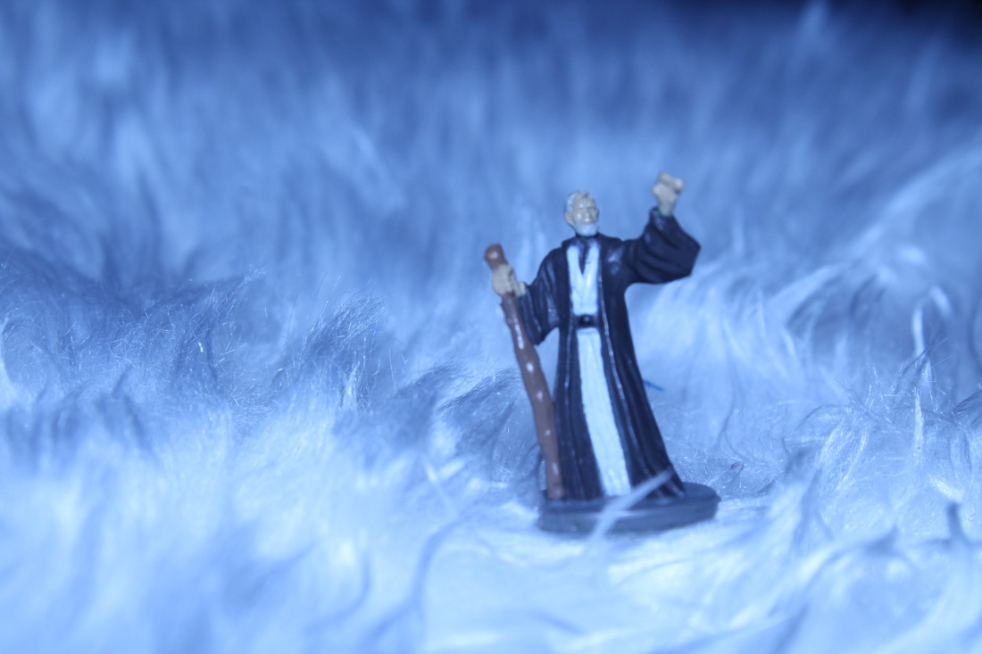
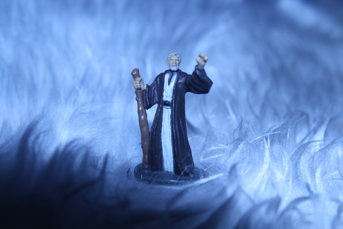
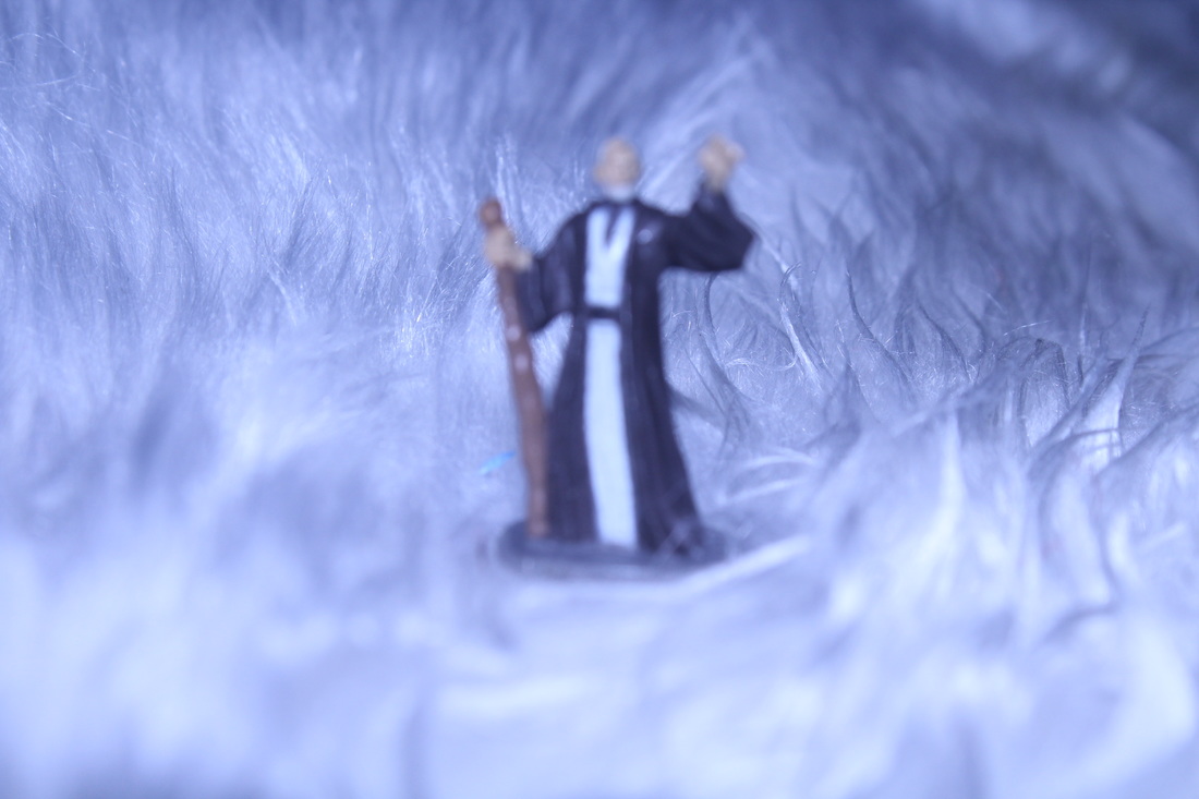
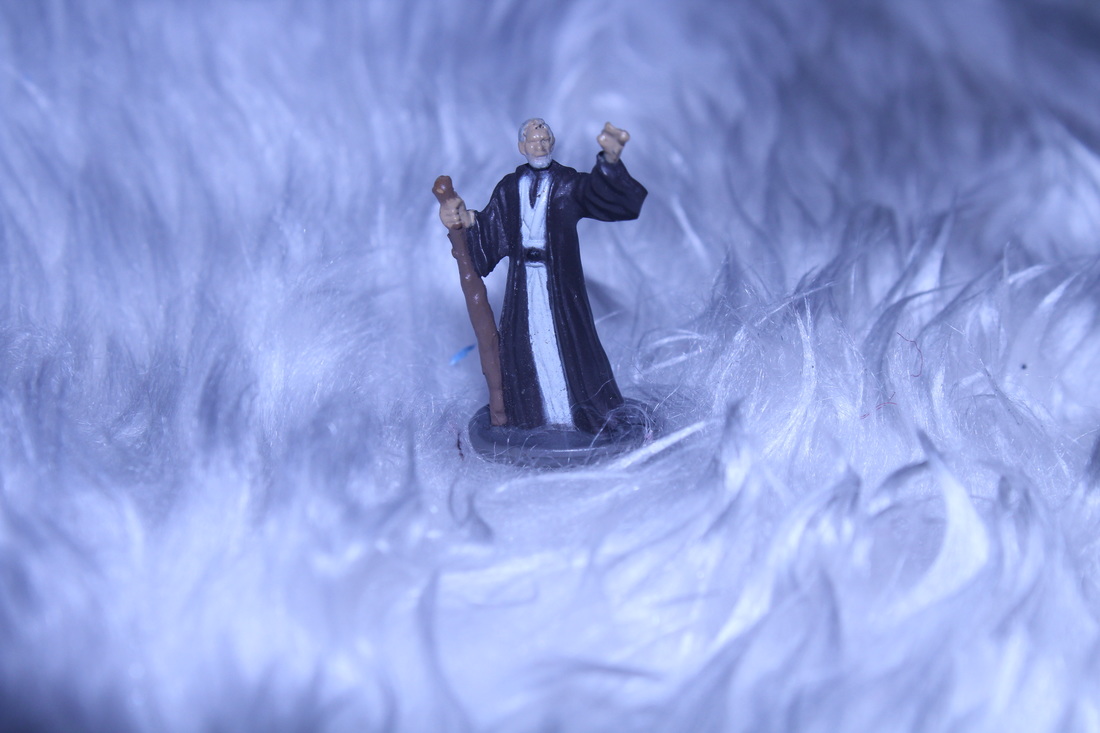

In shoot five I decided to create a snow theme for the figures. I will use the combination of exposure and the white balance has enabled me to create sense of coldness within the air. I also used different materials such as, icing sugar, wool, paper and grass to create a frosty affect.
I am not very fond of...
|
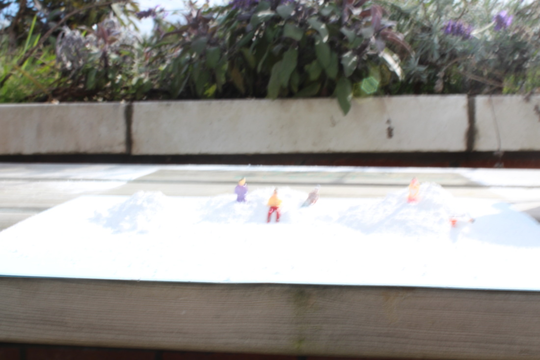
I am not fond of this photograph because there is no clear focus point as it is not focusing on foreground or background or the figure. This is apparent in the image within the small depth of field that I used. The camera angle has resulted in the snow and the background not being in uniform. I could have changed the white balance to create an eerie type of scene.
|

|
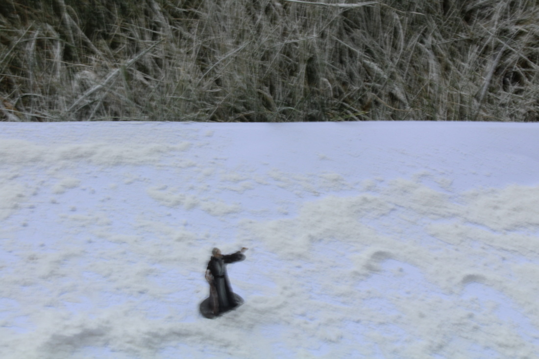
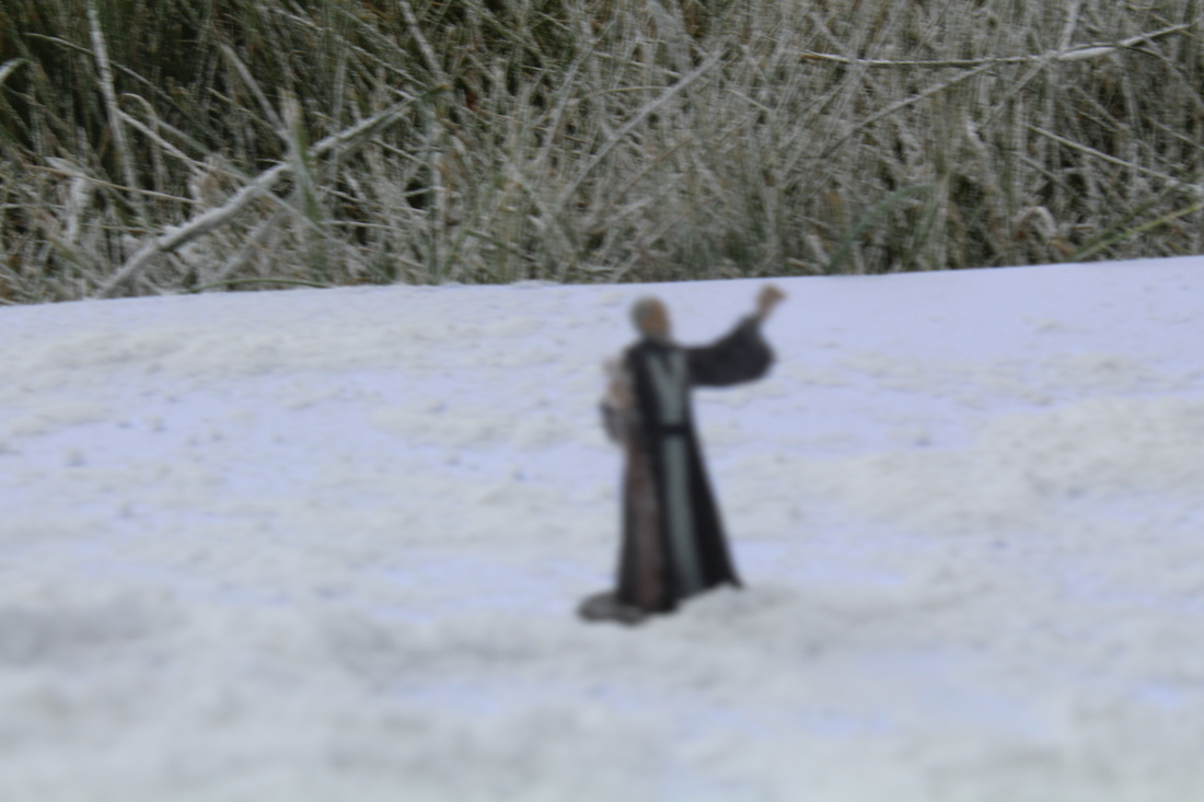
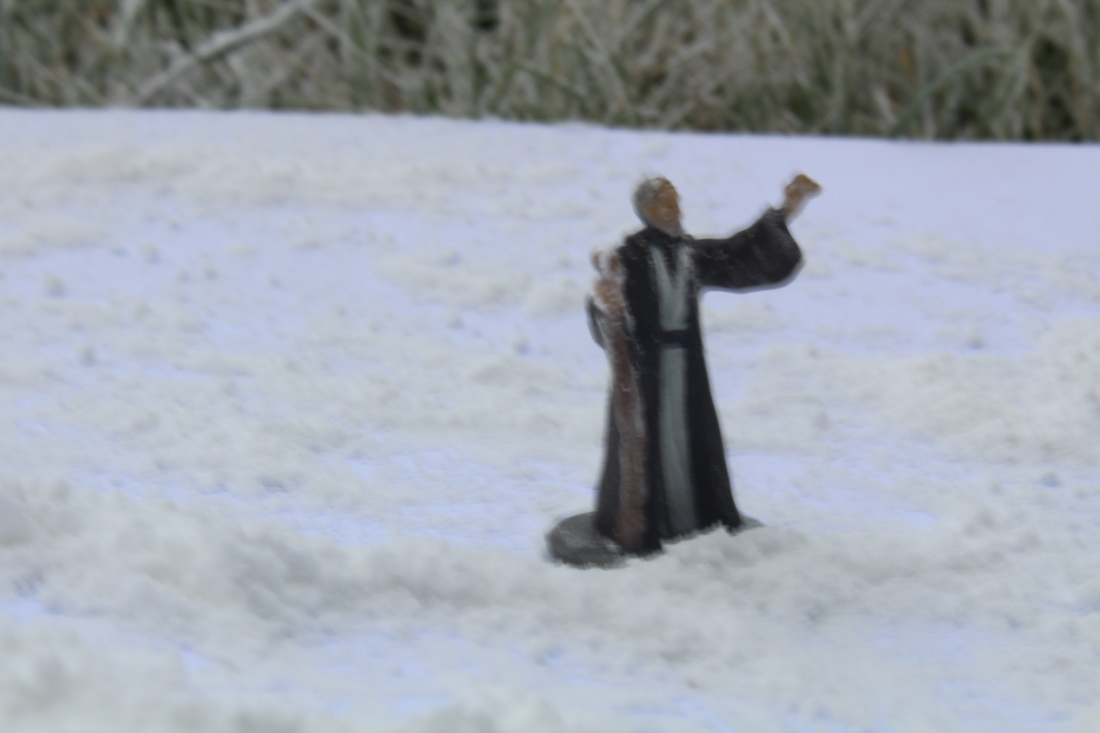
My personal Favourite...

This is my personal favourite as you can see that the scene is frost and it looks like it’s been snowing. The background is blurred out and the figure is in focus. However, I could have made this photograph better by making the figure look as if he is casting a spell by taking a photograph where I sprinkle caster sugar in front of him.
The good within my shoots...


evaluation
Overall, I feel that the unit of Slinkachu was a good learning curve to introduce myself to the basics of photography. Throughout this unit I have learnt many different skills to use with the miniature figures.
Changing the aperture settings, adapting the exposure used within the images and switching between manual and autofocus was at first challenging, but I think that I have grown much more confident in using these features when taking images using the cameras. If I had more time on this unit I think I would improve the themes for more detail and the way I used the figures for the shoots. Also, I would like to create more of a detailed story for the figures as I don't think I explained it very well within the shoots.
Changing the aperture settings, adapting the exposure used within the images and switching between manual and autofocus was at first challenging, but I think that I have grown much more confident in using these features when taking images using the cameras. If I had more time on this unit I think I would improve the themes for more detail and the way I used the figures for the shoots. Also, I would like to create more of a detailed story for the figures as I don't think I explained it very well within the shoots.
