Mind map
To start off my exam, I used a website called coggle to create a mind map of ideas, example photographs of photographers and websites for my research. I personally chose landscapes as I was intrigued by the different ways to present amazing looking landscapes. I also think that doing creative landscapes will show more skills that have learnt throughout photography. I think this theme is going to be challenging for me as I need to do these shoots out of school and go to different places to make all photographs different.
My inspiration...
|
|
I personally was fascinated, by these photographs, simply because I believe a lot of imagination has gone into these photographs to create such unique pieces.
|
|


Randy Scott Slavin

Having spent years as a commercial and music video director, Slavin’s “Alternate Perspectives” series was recently discovered by the media and new collectors, one of whom, celebrity jewellery designer and goldsmith Kristen Farrell, invited Slavin to create a collaborative exhibition in her namesake Soho gallery setting. The two New York-based artists share a visual language, which has been described similarly as surrealist, alchemical, otherworldly and futuristic. Slavin shoots with a Nikon D800 and the images are printed as Metallic Digital C prints mounted on non-glare Plexiglas in sizes ranging from 2 x 2 feet to 4 x 6 feet. Each of Slavin’s images is produced in signed, limited editions of 33. Slavin’s circular panoramic digital technique is a way of seeing only made possible through digital methods and is an orientation he masterfully devised after much experimentation. The time required to capture the images and then create the photographs, which can consist of hundreds of photos “stitched” together to create a single 360-degree image.
|
|


The best...

|
This photograph, in my opinion is my personal favourite. I like the way that Slavin has manipulated an original image of woodland to make it look abnormal, 'spikes' as such. I find it looks as if the photograph is took in a hole in a tree and makes it look like a 'peep hole' that some would look through to see the scenery.
|
The worst...

|
Personally, in my opinion, I found this photograph was my least favourite out of Slavin's shoots. Simply because of the fact it looks too crammed within the photograph. In my opinion the way this photograph has turned out I find he sky looks somewhat 'fake'. And I generally did not find this photograph appealing to me.
|
Doug Aitkin
Doug Aitken is an American artist and filmmaker. Defying definitions of genre, he explores every medium, from film and installations to architectural interventions. His work has been featured in numerous exhibitions around the world, in such institutions as the Whitney Museum of American Art, The Museum of Modern Art, the Vienna Secession, the Serpentine Gallery in London and the Centre Georges Pompidou in Paris. He participated in the Whitney Biennial 1997 and 2000 and earned the International Prize at the Venice Biennale in 1999 for the installation “electric earth”. Aitken received the 2012 Nam June Paik Art Centre Prize, and the 2013 Smithsonian Magazine American Ingenuity Award: Visual Arts.
|
|


The best...

|
In my opinion, this is one of the best photographs I have seen from Doug Aitkin. The reason for this is simply because the image is unique in comparison to the other photographs he has produced. I personally like the way he has used an outline of a country and put a photograph in it. The photograph is plain and simple however, the country outline makes it look more intriguing and it really inspires me to want to do something comparable to this within one of my shoots.
|
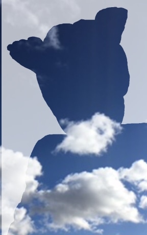
The worst...
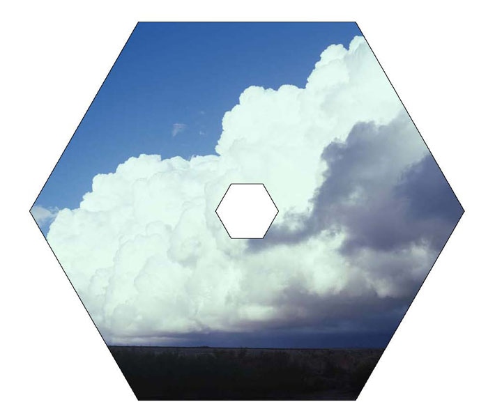
|
In my opinion, one of the least appealing photographs within Aitkin's work. This is simply due to the lack of imagination. I find that this photograph is very simple being a cloud in a shape. Yes, this photograph would have been nice scenery however, I find it very boring and Doug Aitkin could have made something more out of this photograph. Moreover, I find that the basic photograph has a nice contrast and brightness to make the cloud stand out.
|
Thomas Lamadieu
Elevating street art to the heavens above, French artist Thomas Lamadieu has made a name for himself sketching whimsical scenes in the sky. Taking expanses of blue sky framed by rooftops and building facades for inspiration, Lamadieu has been squeezing a cast of colourful characters into urban panoramas in cities from Berlin to Montreal since 2011. In Lamadieu’s playful skyscapes, a bearded figure in Breton stripes is caught spray-painting a cloud in the sky between Parisian apartment blocks, while a surreal game of masked cat and mouse is inked above the streets of Hamburg
|
|


The best...

|
This is, in my opinion, the best photograph in Lamadieu's. I find this because Lamadieu has used his style of photography and his artistic skills and put them together to create a unique photograph. I like the way he has used the building and made the drawing 'mix' with the building so the building is like an outline for the drawing. I have never seen this done before and I found it intriguing.
|
Jasper James...
Jasper James is a China based photographer working in Shanghai and Beijing, shooting editorial, advertising and corporate work.His photography ranges from portrait, travel and interiors to concept driven projects.Over the past decade he has lived and worked in New York, London and Beijing, covering assignments around the globe for some of the worlds leading magazines, design and advertising clients.
|
|


Shoot One...


For My first shoot, I decided to use photographs to create my own creative landscape to see what type of different edits I could do. For this shoot I used a nice photograph of flowers and sunset and used a picture of some people's feet to use their socks. I removed the parts where I wanted the background on a couple of the socks and then put the background in. I edited out the magnified glass in the corner and changed the contrast of the photograph. I tried this with a couple different backgrounds.
Final photograph...

I particularly like this turn out as it is different to what I have seen before. I find the dark background and the landscape put together makes the photograph stand out more than when the photographs were on their own.
Shoot Two...


For this shoot I also decided to use photographs to create my own creative landscape to see what type of different edits I could do. This was created by using squares and rectangles. It was pretty simple to do and I like the final outcome.
Final photograph...
This is my final photograph from this shoot, I personally thing that it was very simple and easy to do but had a nice looking turn out.
Shoot Three...


Final Photograph...
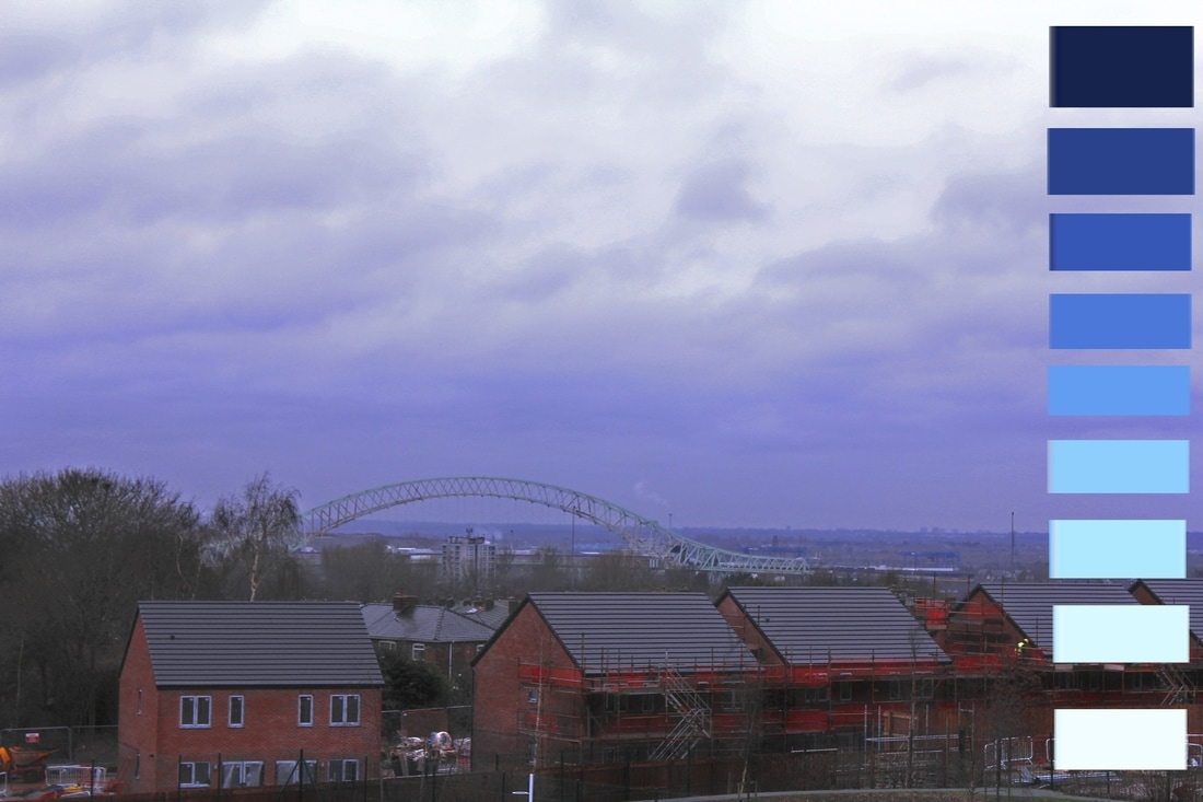
For this shoot I chose to use the colours of the landscape and change them to make them more vibrant than they were. I also used a blue colour scale to show different colours of the sky.
Shoot Four...


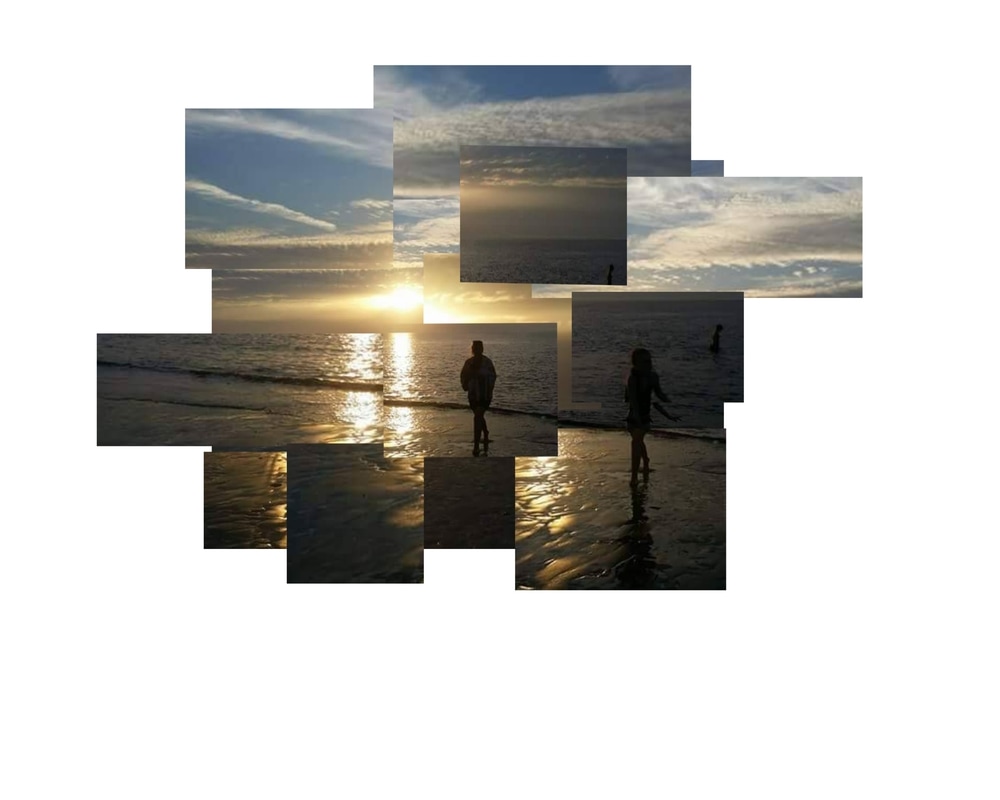
In this shoot, I decided to travel to Liverpool to take some photographs of the scenery. I then created a collage using the different images.
Final Photograph...

In this shoot I was experimenting with different kind of ways to present the image. In the end I chose to do a collage and found it was quiet simple and easy to do to start of my creative landscapes theme. I used three of the same imaged but with different contrasts and filters to create a different kind of effect. I made this on card by cutting all three pictures in similar shaped rectangles and mixed them together to create this collage.
The bad...

|
This was the worst photograph out of the shoot because there are people walking through the picture and I find it looks so much better when the photograph is just of the sea and the sky as it creates a nice effect. |
The good...

This is my best image out of the shoot because it's the sea and the sky which gives off a nice affect to the photograph. I find that even though there are houses and boats in the background they are blocked out due to the contrast. I like the way the sky looks blue with bright white clouds and the sun shining with the reflection on the sea and the sea looking a dark kind of colour.
Shoot Five...


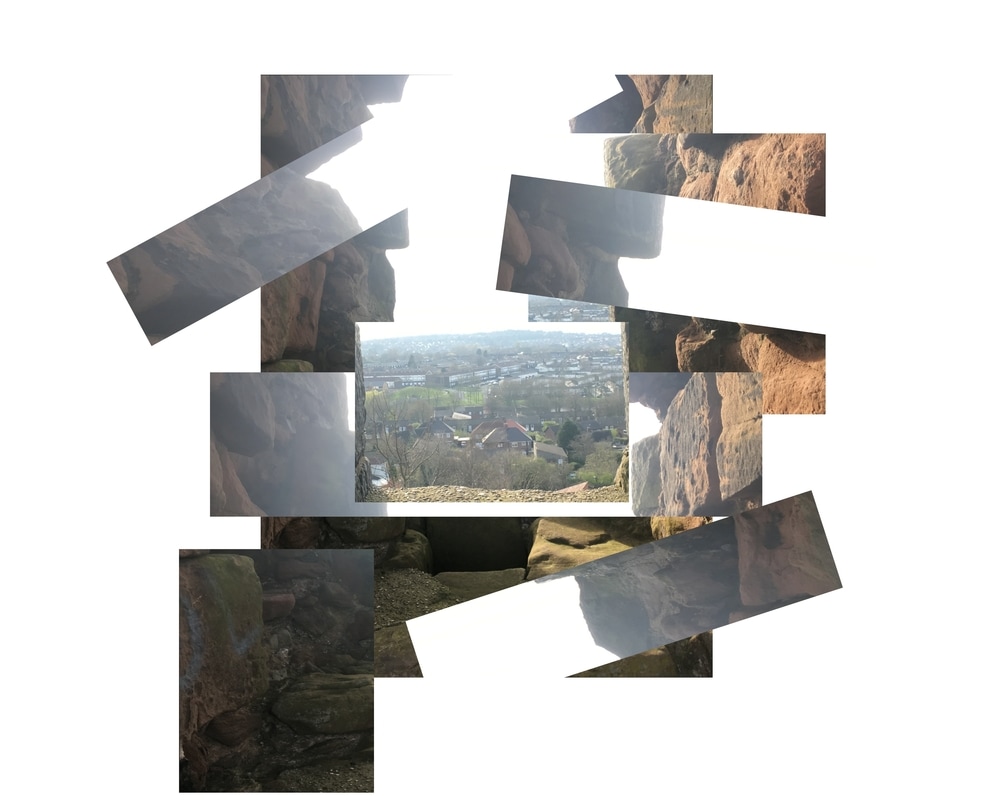
The bad...
|
I find that this is my worst photograph because it is not the position I wanted to take it in as there are lamps in it and signs and can see a bridge which I did not like about this photograph. Also the sky seems a lot brighter on this photograph in comparison to my other photographs which I also did not like about this photograph. |
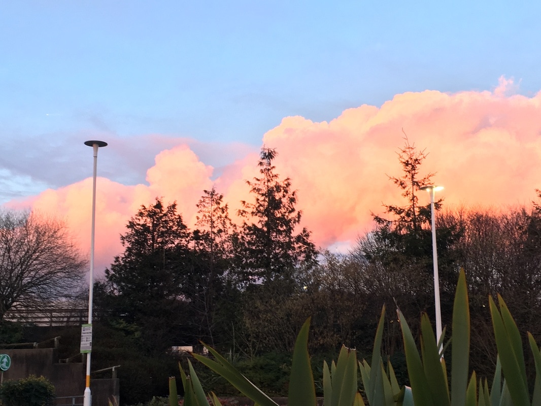
The good...

I find that this is my best photograph from this shoot as it has less to it and is simple. I personally like the colour of the cloud on this photograph as the sun it going down and the sky stands out more within this photograph.
Final photograph...
In this shoot I particularly like this image that I took as it stood out to me when I seen the colour of the clouds as the sun was going down. I edited the image using photo plus. I had this photograph inspiration from a photographer called Victoria Siemer. I also find that this photograph demonstrates perfectly with the theme of creative landscapes. I was inspired by the different photographs she took and the different techniques she used to edit them.
shoot Six...


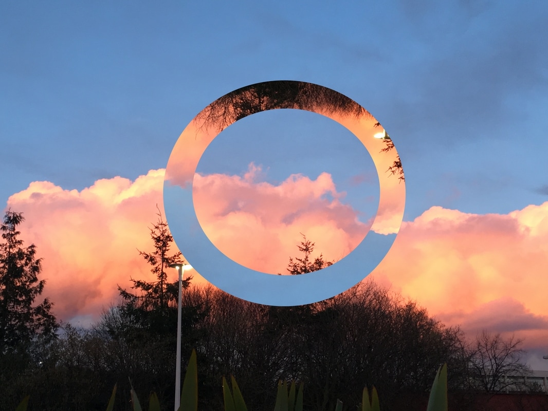
For this shoot I went for something different. I used a photograph of the internet of trees and I also used a photograph of my own eye. I then decided to put them both together so it was like a reflection of the landscape in my eye. To do this I had to cut the trees into a circle to fit the iris and then I put it over and changed the Opacity so you could see both the landscape and the iris at the same time creating a reflective affect within the photograph. This would have worked better if the eye photograph had a clearer focus point however this does draw your attention to the iris.
Final photograph...

Shoot Seven...


Final Photograph...

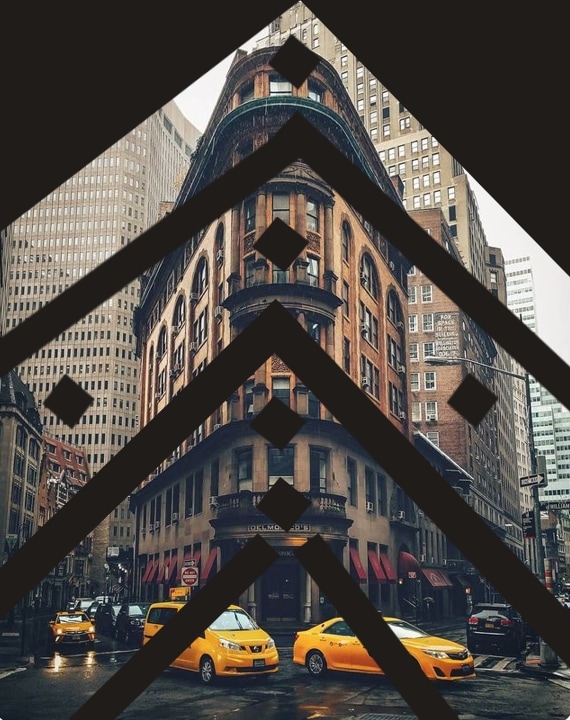
In this shoot, as shoot one I was also experimenting with different ways to present my photographs. For this I made it on card and printed out my pictures and putting the "V" kind of shapes on tops the original image. I outlined the "V" shapes to make them stand out more within the image. I also find that this photograph demonstrates perfectly with the theme of creative landscapes.
The bad...

|
This was my worst image within the shoot because it is out of focus and not in the position I would like it to be in where you can see the track where people walk through the forest. |
The good...

find that this is my best photograph within the shoot as it is in the right position and you can see the track where people walk through the forest it just carries on. I also like how you can see the texture of the trees and the leaves that are on the floor. However, I find that the photograph would be nicer if the sky wasn't as white as it looks on this photograph, it would also benefit from a focal point in the foreground
Final piece...
mind map...
Research...
Antonio Mora...
Antonio Mora, a creative art director since 1995, gradually gravitated towards the more artistic realm of his profession. His work—both personal and evocative—are meant to trigger intense feelings. He has been developing an extensive collection of portraits in which dream worlds are superimposed with reality, creating hybrid beings of great beauty and expressive force. Having mastered the technique of digital collage using various tools such as filters, hues, saturations and gradients of opacity, Antonio’s creative process results in unified textures and the merging of two photographs.
Antonio Mora, a creative art director since 1995, gradually gravitated towards the more artistic realm of his profession. His work—both personal and evocative—are meant to trigger intense feelings. He has been developing an extensive collection of portraits in which dream worlds are superimposed with reality, creating hybrid beings of great beauty and expressive force. Having mastered the technique of digital collage using various tools such as filters, hues, saturations and gradients of opacity, Antonio’s creative process results in unified textures and the merging of two photographs.


Some I have done as practice...


Evaluation...


I enjoyed doing this unit due to the different scenery and different edits that could go into this. I believe my favourite shoot out of them all was shoot seven, something about it just intrigues me. I found that it was difficult finding different landscapes within my living area so I had to go to new places to get some inspiration for my shoots... I find that learning other skills in Unit one really benefitted me for this unit because it made my photographs turn out better. I have really enjoyed photography and I hope you like my photographs :)
First Edit...


Final Edit...
For this edit I used two photographs from the beach. I cut them up into different rectangles and squares and then I piled them up to create this simple montage.
Edit two...


Final Edit...
For this edit I used two photographs from the beach. I cut them up into different rectangles and squares and then I piled them up to create this simple montage.
Exam...
I am going to explore my creative landscapes further influenced by Jasper James but rather than cities I am going to use my landscape photography
Portraits...
I


Landscapes...


First edit...


Final Edit...
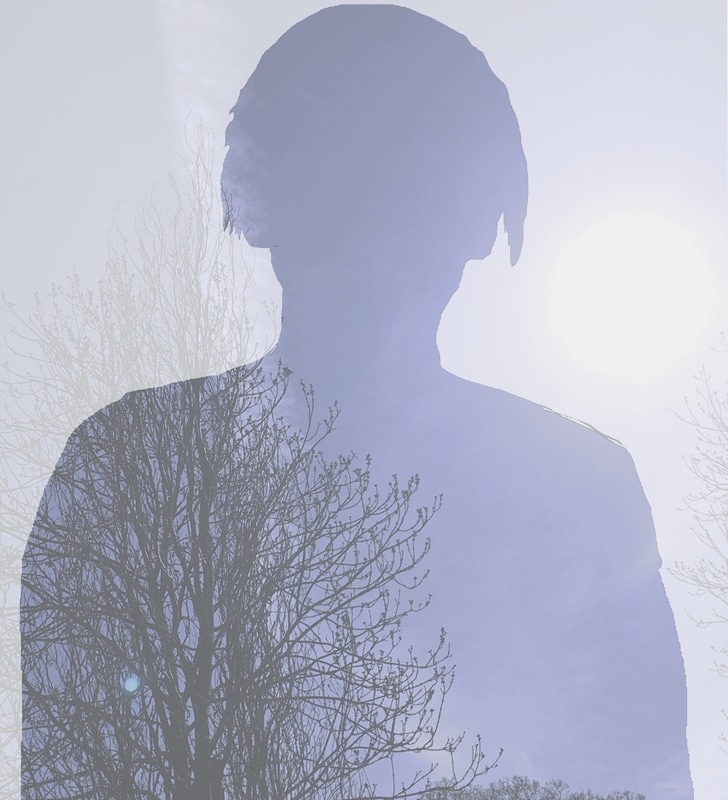
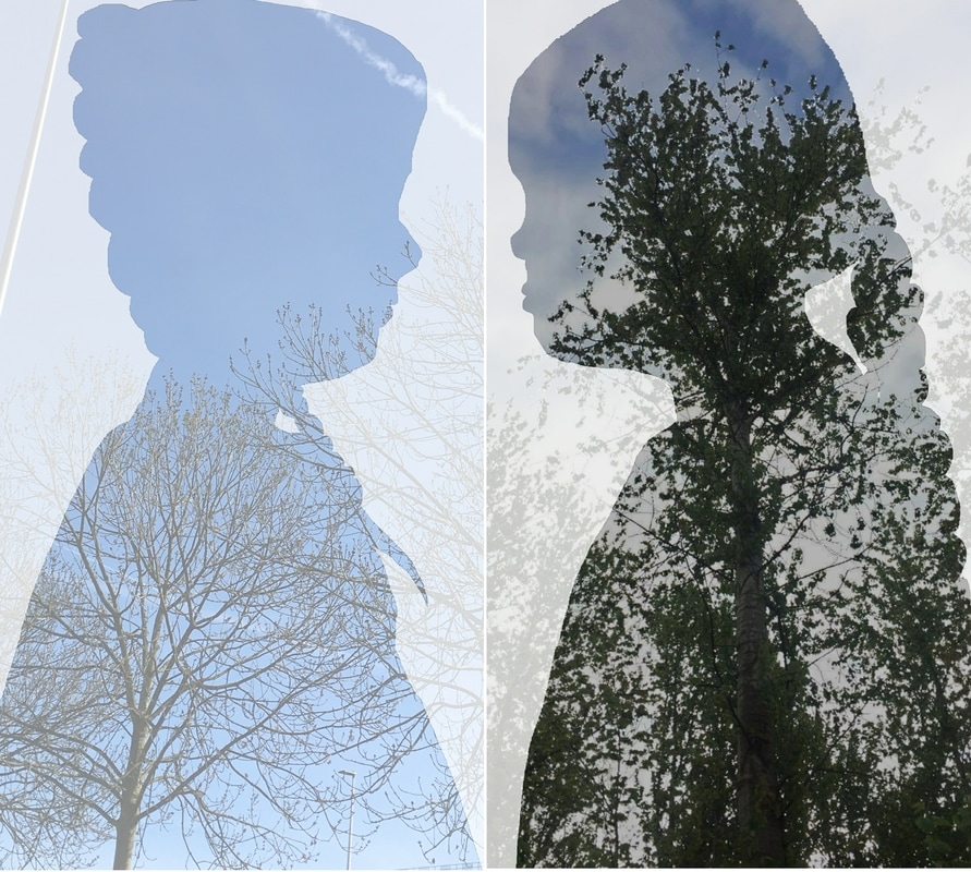
For this shoot I used two pictures and two plain white backgrounds. Firstly, I used a plain white background and put the landscape photograph on top of it. after that I cut out the portrait of the girl and put that on another plain white background, I then cut around the girl again so it just leaves the outline as shown above. After this I edited my landscape photograph of a tree and sky to change the exposure of it to make it stand out more. I then put the cut out girl on top of the landscape and changed the opacity creating the affect above.
Second edit...


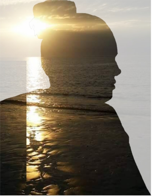
For this shoot I used two pictures and two plain white backgrounds the same as the first edit I had done. Firstly, I used a plain white background and put the landscape photograph of a beach on top of it. after that I cut out the portrait of a different girl and put that on another plain white background, I then cut around the girl again so it just leaves the outline as shown above. I then put the cut out girl on top of the landscape and changed the opacity creating the affect above.
Third edit...


Final Edit...
For this shoot I used two pictures and two plain white backgrounds. Firstly, I used a plain white background and put the landscape photograph on top of it. after that I cut out the portrait of the same girl in the previous photograph and put that on another plain white background, I then cut around the girl again so it just leaves the outline as shown above. I then put the cut out girl on top of the landscape and changed the opacity creating the affect above.
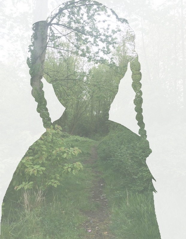
Fourth edit...


Final Edit...
For this shoot, again, I used two pictures and two plain white backgrounds the same as the first edit I had done. Firstly, I used a plain white background and put the landscape photograph on top of it. after that I cut out the portrait of a different girl and put that on another plain white background, I then cut around the girl again so it just leaves the outline as shown above. After this I edited my landscape photograph of a forest to change the exposure of it to make it stand out more. I decided to add the girls hair to this photograph to make it look different to the others and I then put the cut out girl on top of the landscape and changed the opacity creating the affect above.
Fifth Edit...


Final edit...
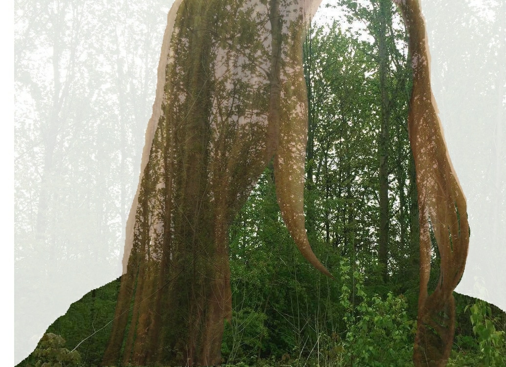
For this shoot, I used four photographs and two plain white backgrounds. Firstly, I used a plain white background and put the landscape photograph on top of it. after that I cut out the portrait of a different girl and put that on another plain white background, I then cut around the girl again so it just leaves the outline as shown above. After this I edited my landscape photograph of a forest to change the exposure of it to make it stand out more. I then put the cut out girl on top of the landscape and changed the opacity creating the affect above. I done this twice for each of the girls and made it so they are facing each other and made it look as though they are some what "talking".
Sixth Edit...


final edit...
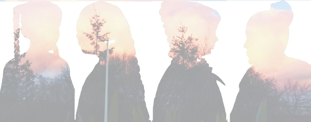
For this shoot, I used four photographs and two backgrounds. Firstly, I used a plain white background and put the landscape photograph on top of it. after that I cut out the portrait of a different girls and put that on another plain white background, I then cut around the girls again so it just leaves the outline as shown above. After this I edited my landscape photograph of the sky to change the opacity of it to make the girls stand out more. I done this twice for each of the girls and made it so they are facing each other and made it look as though they are some what "talking".
Seventh Edit...


Final edit...
For this shoot I used two pictures and two plain white backgrounds the same as the first edit I had done. Firstly, I used a plain white background and put the landscape photograph on top of it. after that I cut out the portrait of a different girl and put that on another plain white background, I then cut around the girl again so it just leaves the outline as shown above. After this I edited my landscape photograph of a forest to change the exposure of it to make it stand out more. I then put the cut out girl on top of the landscape and changed the opacity creating the affect above.
Best photographs...


Evaluation...
In conclusion to my exam I done on the computer using photo plus. The whole process took ten hours. I believe that what I wanted to portray was not intentionally what I was going to do. I was originally going from the photographer Antonio Mora. I then decided to go and use the photographer ( ). I find that my exam turned out very well to what I expected. I have a couple of underachieving points about my Edits such as, some of the whiteness is faded out too much or the background photograph is too bold to see the outline of the person. The thing I found most difficult about my exam was cutting out the people to see their features so they are bold and stand out over the background photograph. I also have a couple of exceptional points such as the way the outline stand out so you know what the photograph is. During my time doing my exam I have grown a greater understanding to edit photographs and manipulating them to stand to or fade away. My exam piece inspired me to try new techniques into editing my final pieces and to improve to make my work better. Overall, I believe that I am happy with the way my exam turned out as it is something I have not experienced before and I found it intriguing to try it for my first time and it turned out better than expected and I am proud of my final turn out.
